UX/UI Case Study: Meggaball
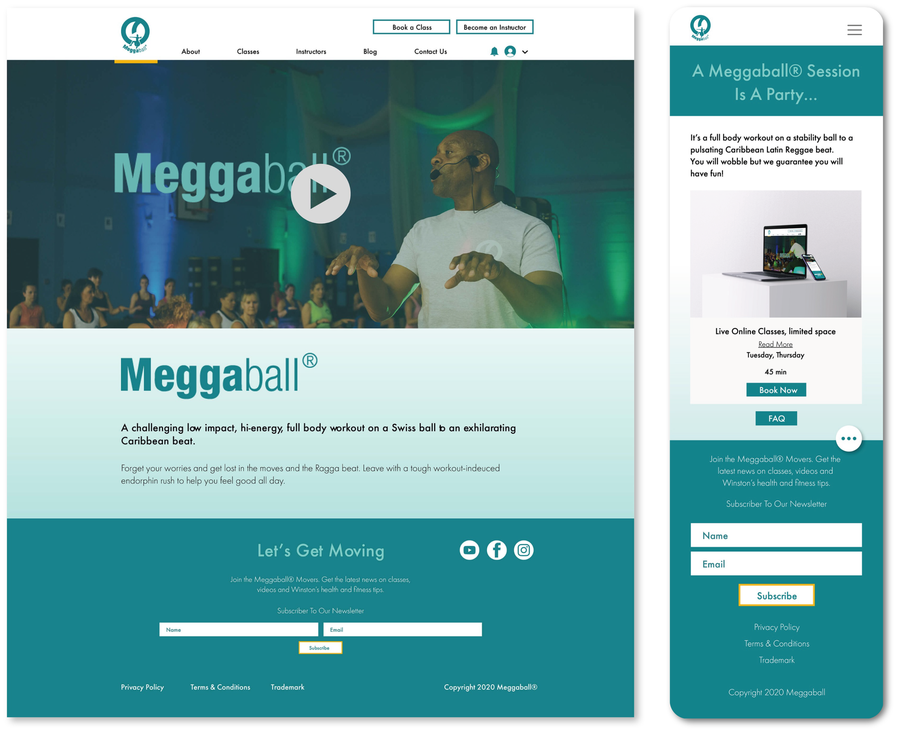

A re-design of an existing website for a London-based fitness program
Overview
The project came from a client requesting to re-design an existing website layout to enhance the user experience. The goal of the website is to educate new/existing customers on a fitness program called Meggaball, and provide a platform for users to sign up for scheduled online classes.
Contributions
Strategy, Information Architecture, Prototyping, High Fidelity Mockups, Website Rebuild on Wix
Duration
Nov, 2020 ~ Feb, 2021
Challenges & Goals
- With the pandemic crisis, the client needed a better user experience for his existing website layout that was already built on Wix. His needs were to better educate users on his program and provide a platform for users to easily sign-up for online classes.
- Information Architecture had to be re-designed for a better user flow and user experience.
- The re-design had to be done using existing UI elements and content which in some situations became a constraint.
Tools Used
Adobe XD, Adobe Photoshop, Adobe Illustrator, Wix
1 Website Audit
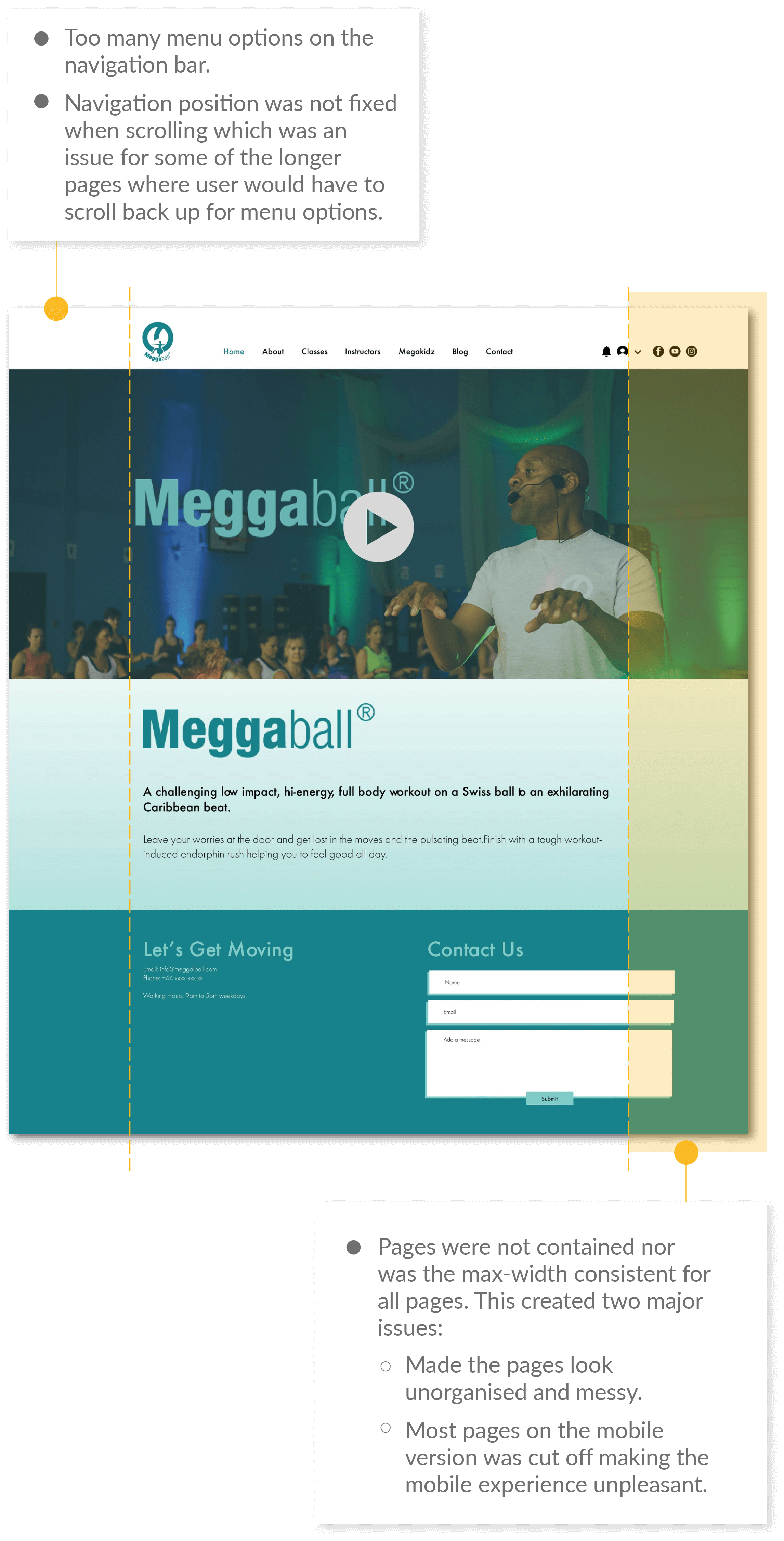
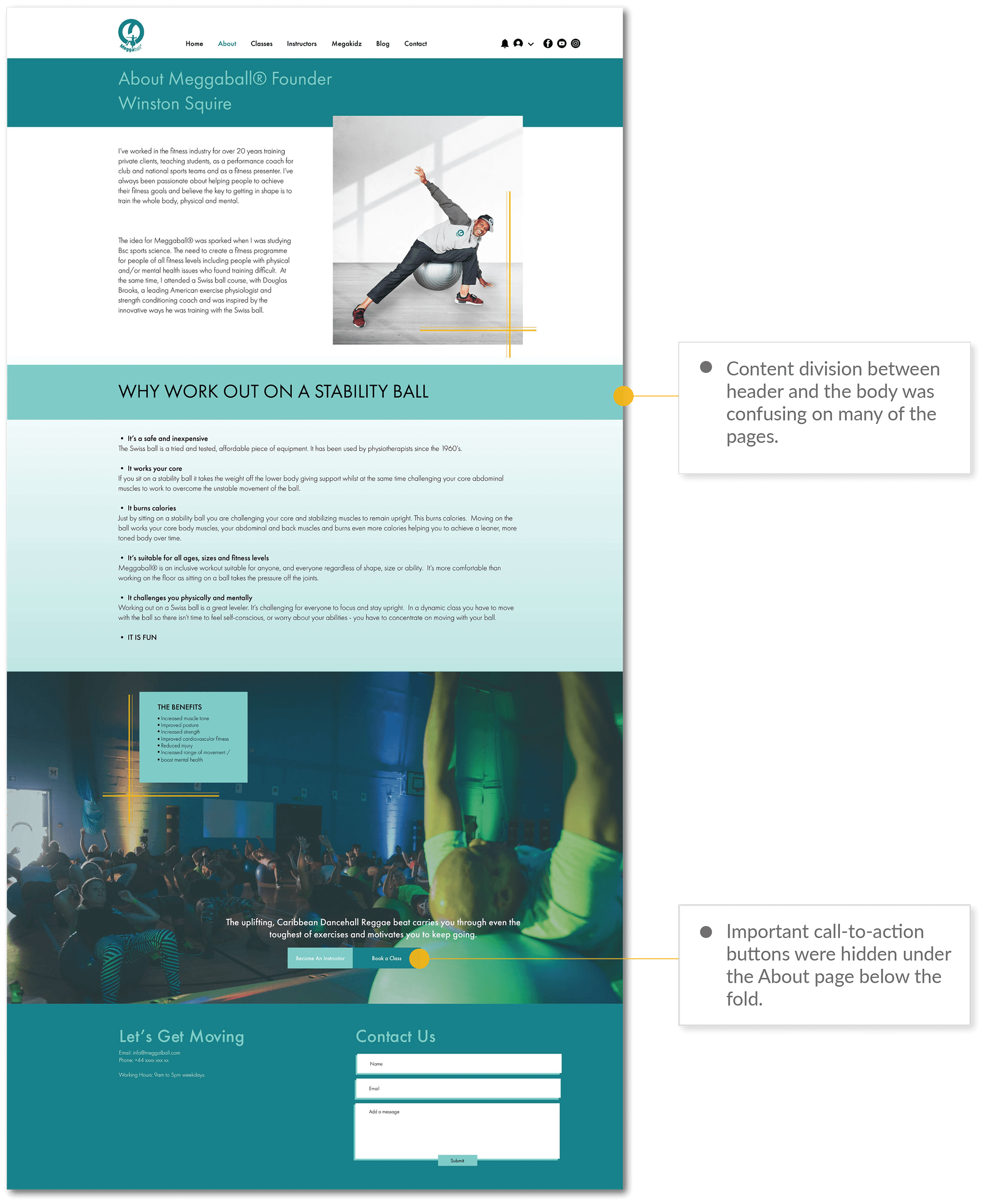
All pages were carefully audited and while there were improvement ideas suggested in most pages, the most critical issues related to user experience were narrowed down as follows:
2 Information Architecture
Too many menu options on the navigation made it difficult to understand how the information was organised on the site. This also caused an issue of placing equal weight on both secondary information (i.e. social media channels) and primary information (i.e. about, classes) which makes it frustrating for users to navigate the website. For this reason, upon discussing with the client, the information architecture was considered critical to re-build and we decided to consider a different way of organising content and information.
The client also wanted to update new content which had to be considered in the new information architecture:
- FAQ for classes
- Newsletter sign-up form
- Testimonials (video)
- Pricing and package deals for classes
- Privacy Policy
- Terms & Conditions
- Trademark
- Copyright
Old Sitemap

Proposed Sitemap
Primary Content

Secondary Content

Proposed Changes
- Separate primary and secondary content to make it easier for users to find relevant information.
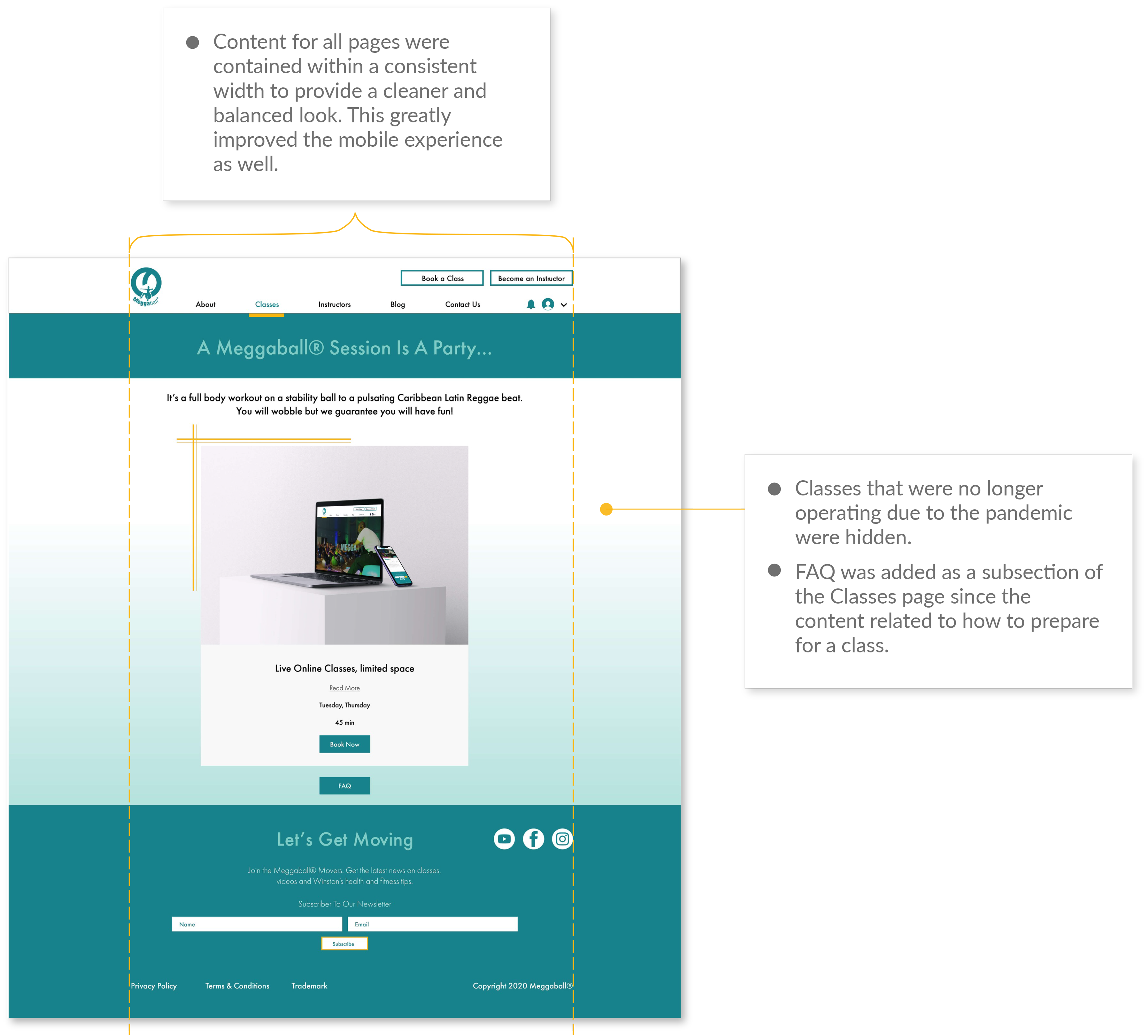
- Hide pages that are no longer in operation due to the COVID-19 pandemic (Megakidz / Face-to-face classes).
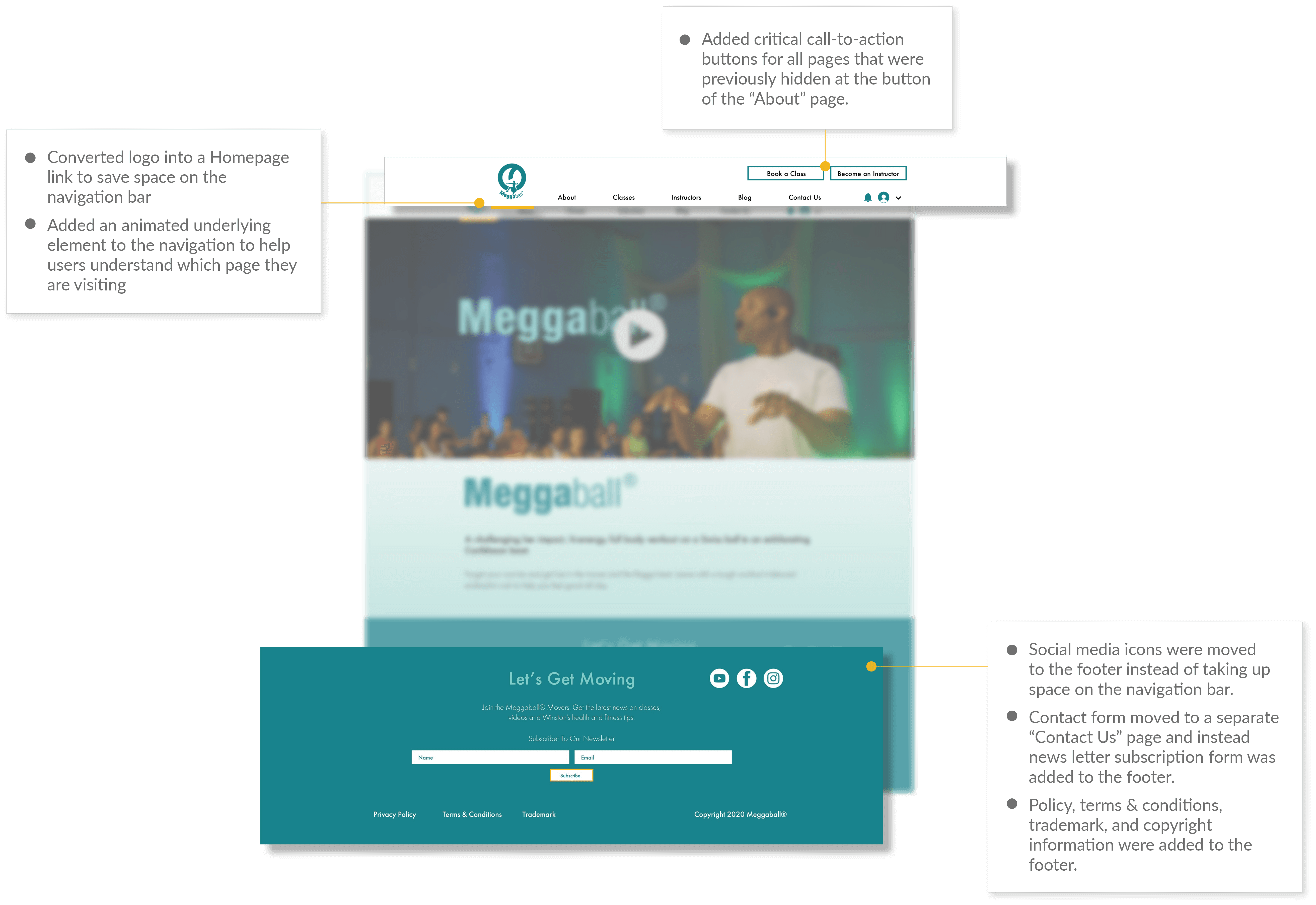
- Use the real estate on the footer section to add policy, terms & conditions, trademark, and copyright information.
- Add the news letter sign-up form on the footer and create a separate page for Contacts and office hour information.
- Make FAQ a subsection under Classes.
- Create a Plan & Pricing page to provide users information on pricing plans for the online class.
3 High Fidelity
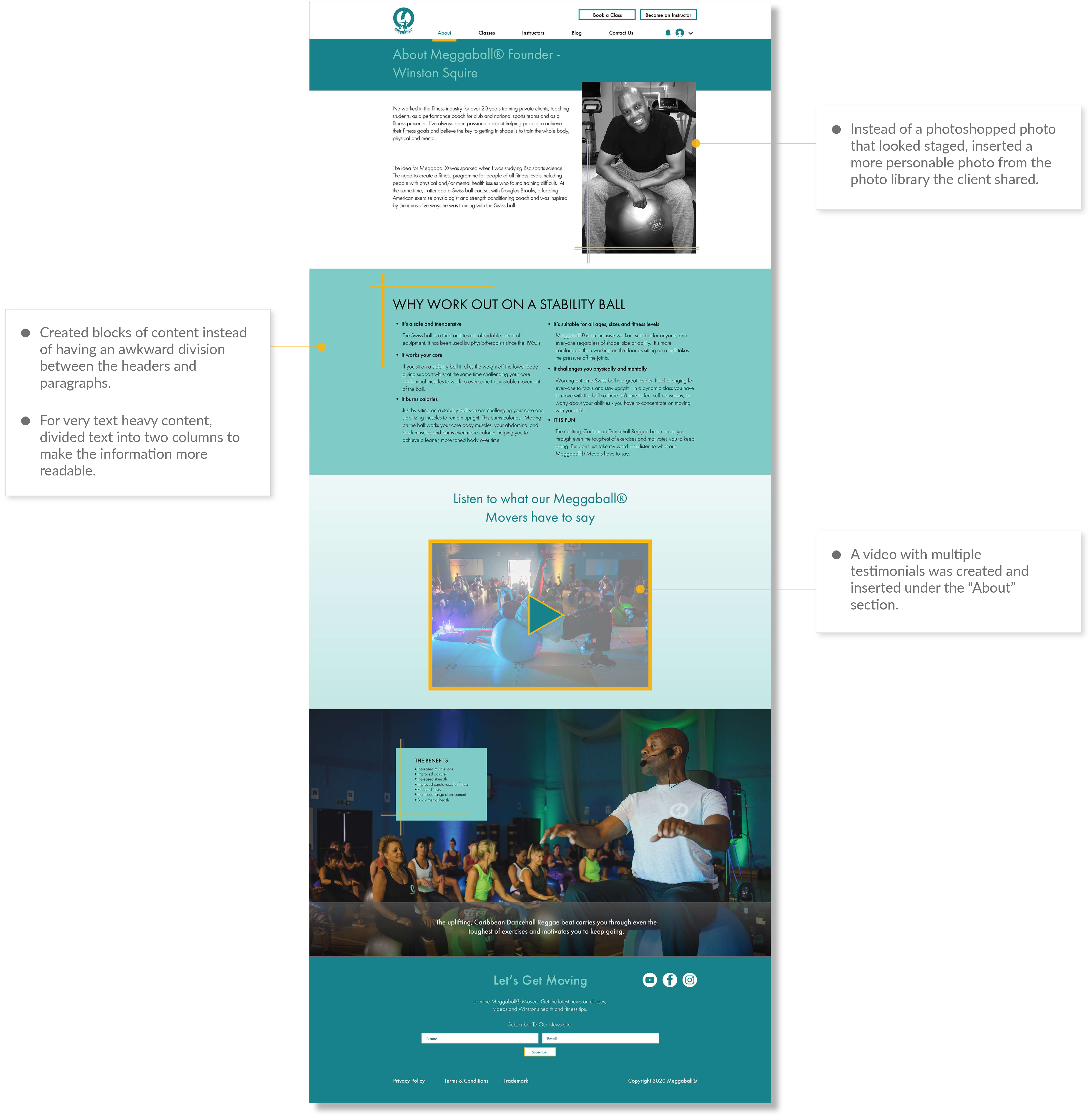
The following are the major changes that took place once the information architecture and the new sitemap was approved by the client. For comparison, please refer to the “Website Audit” section to check the layout of the old website.
4 Website Re-Design
Desktop Demo
Mobile Demo
5 Final Thoughts
There were time and budget constraints for this project, and several improvements were suggested to the client for future consideration:
Color Contrast
Some of the text and background colors did not have a big enough color contrast which failed the AA standard, but for the time being the client decided to revisit this issue in the future. Fortunately, I was able to make sure that at least critical information and call-to-action elements met the AA standard. Using different different color combination was suggested for future considerations.Platform Limitations
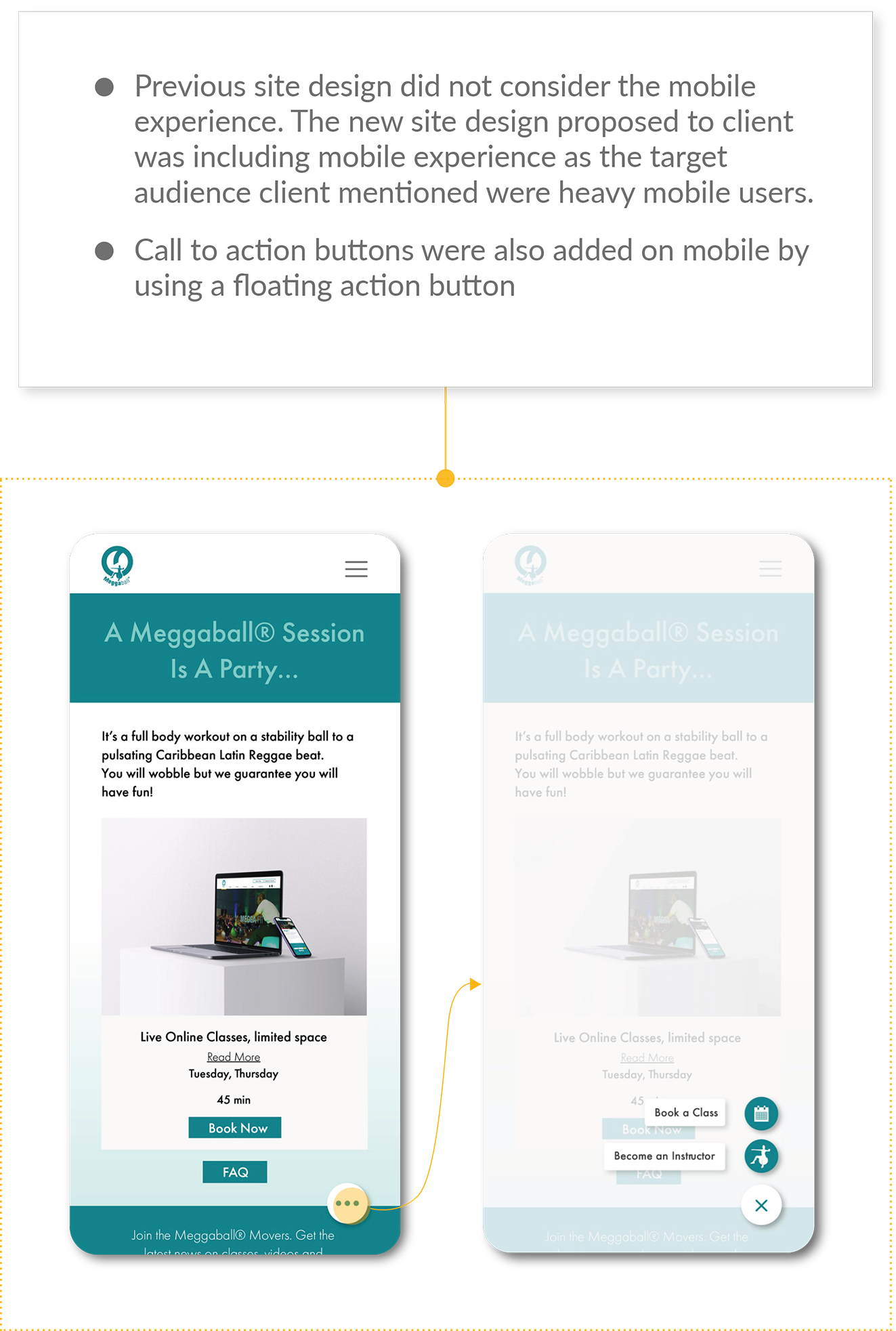
While most of the design was based on features that Wix offered, some of the design elements could not be implemented due to the platform's limitations. An example is where I could only use a set of pre-defined icons for the the floating action buttons on the mobile design instead of customised icons that were developed during the project.
Mobile First Approach
Wix required users to build the design on desktop first instead of mobile. While the platform itself offered responsive design, there were a lot of tweaking and adjustments to be made for the mobile screen in order to optimise the mobile experience. However, given that the previous design did not consider mobile experience at all, there were huge improvements made for the new site. This was based on discussions with client on expected target customers for his classes, which based on research we concluded that the audience would be heavy mobile users so making a good mobile experience became critical.User Research
While the client did ask his friends for feedback, there was no proper user research conducted for this project due to resource constraints. Once the site goes live, I plan to run Google Analytics to at least track user behavior and see what other improvements can potentially be made for this site.