UX/UI Case Study: CrITY
A travel app designed for discovering hidden spots in a city
Overview
An end-to-end design project with the goal of creating a scavenger hunt app that enables players to hunt for real objects and locations.
Contributions
Strategy, Competitive Analysis, User Research, Usability Testing, Information Architecture, Wireframing, Prototyping, Custom llustrations
Duration
May 1st, 2020 ~ Oct 28th, 2020 (approx. 6 months)
Challenges & Goals
- Apply the design thinking process to create a scavenger hunt app.
- Analyse the industry and the competitive landscape to understand the strength of the competitors, and identify unique opportunities.
- Create a prototype by working through an iterative process based on user testing and feedback.
Tools Used
Adobe XD, Miro, Google Forms, Excel, Adobe Illustrator, Adobe Photoshop, Procreate, Optimal Workshop
1 The Problem
The focus of my design was based on peoples’ interest in learning through gaming opportunities. This developed into combining the idea of one's travel experience and learning about a location, and a scavenger hunt gaming experience that
requires a user to search for hidden objects or spots.
Based on research, the problem statement was defined as follows:
Gamers, who love travelling, want a fun and exclusive experience that helps them learn about historical facts of a location that is not well known to the public.
The hypothesis was that following guide books can be cumbersome, and walking tours can be restricted by schedule or weather conditions. Both options also do not deliver the interactive experience a gamer may seek for.
2 Competitive Analysis
As the idea combines the entertainment aspects of a gaming and travelling, and the educational aspects of learning about a location, multiple products and services were reviewed for the competitive analysis such as:
- Game industry focused on scavenger hunts
- Tour apps focused on Walking Tours
- Tour guide books focused on hidden spots/locations in a city
- Walking Tour Guides
The following four competitors were reviewed in depth for the competitor analysis that included key objectives, overall strategy, marketing advantages, marketing profile, and a SWOT analysis for each competitor*.

* For details of the four competitor prfoiles and SWOT analysis, please click here.
The analysis made it clear that there was an opportunity to capture both the fun and learning experience.
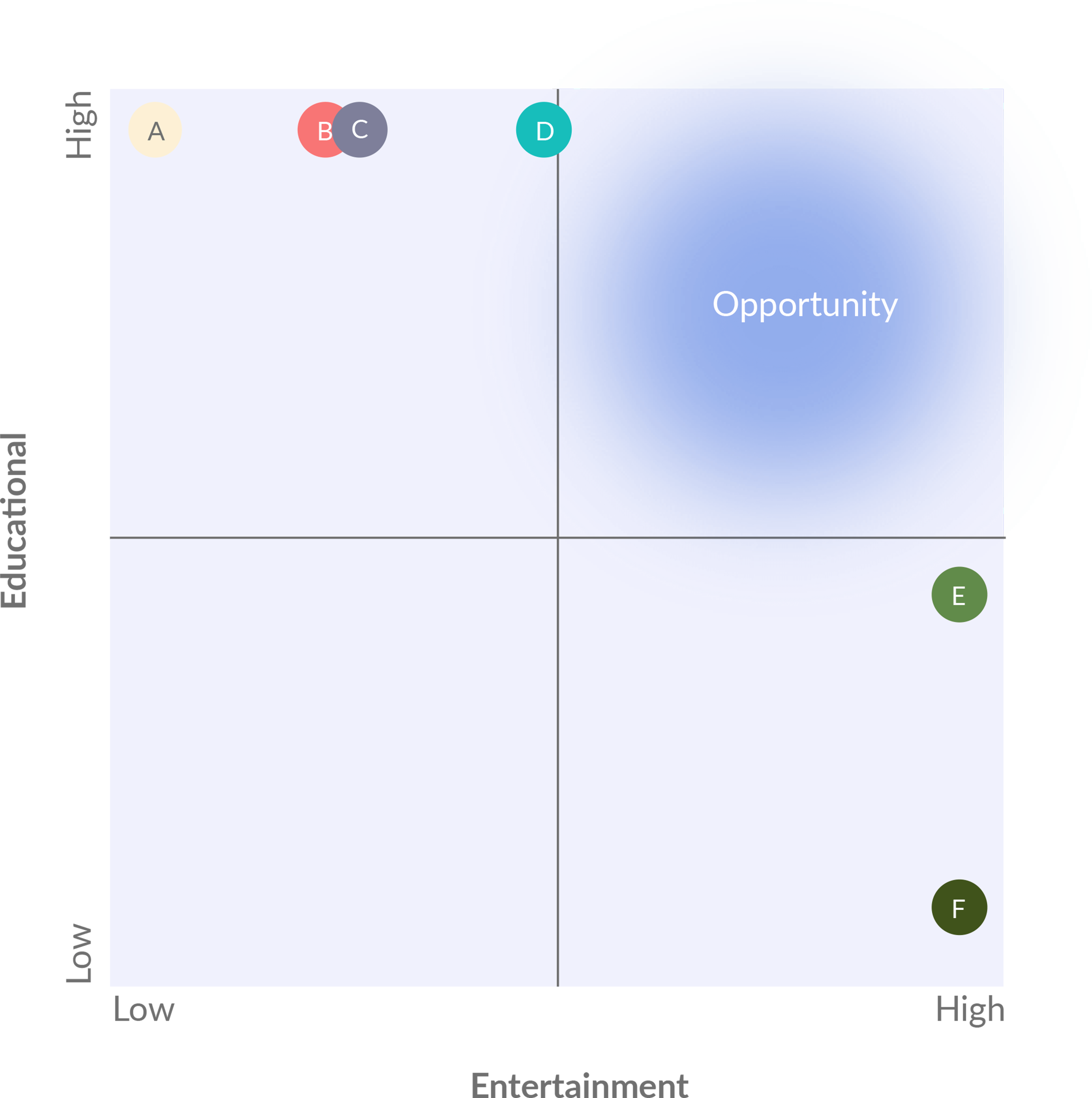
A market analysis was also done where potential competitors were categorized into 6 different competitor types. The following is a quadrant analysis with the different competitor types based on two measurements: entertainment and education.
-
 Guide books focused on major tour sites: A very competitive space delivers the learning experience, but because a lot of information is in text form, there is a lack of the entertainment and interactiveness which makes this option less interesting for gamers.
 -
 Guided walking tours: Also a very competitive space. While the educational element may be high, the fun element can be dependent on the tour guide. Also, the information flow is usually one way which makes it less interesting for gamers.
 -
 Walking tour mobile apps: Depending on the app, storytelling can make this option engaging, but generally the educational aspect is much stronger and the information flow tends to be one way. Some of the competitors in this space are VoiceMap, SideWalk, and GPSmyCity.
 -
 Guide books focused on hidden spots: Users are asked to search for hidden spots that may make this experience engaging. However, there is a lack of interactiveness which makes it less interesting for gamers.
 -
 Scavenger Hunt Apps that focuses on tourism: Since these apps target both the gaming and tourism markets, the idea is very similar to the project. However, most apps in the market are mainly focused on team competition which minimises the experience of actually learning something. Some of the competitors would be Let’s Roam, CityHunt, and Live the City.
 -
 Scavenger Hunt Apps that focuses on gaming: There is a strong element of entertainment that is specifically targeted for gamers. However, the goal for these apps are not designed to learn something new. Some of the competitors would be Geocaching and GooseChase.
3 Persona Development
Personas were developed using both quantitative data collected from surveys and qualitative information from user interviews.
Survey
A user survey was conducted with 26 respondents in total and with interesting differences between the two age groups:
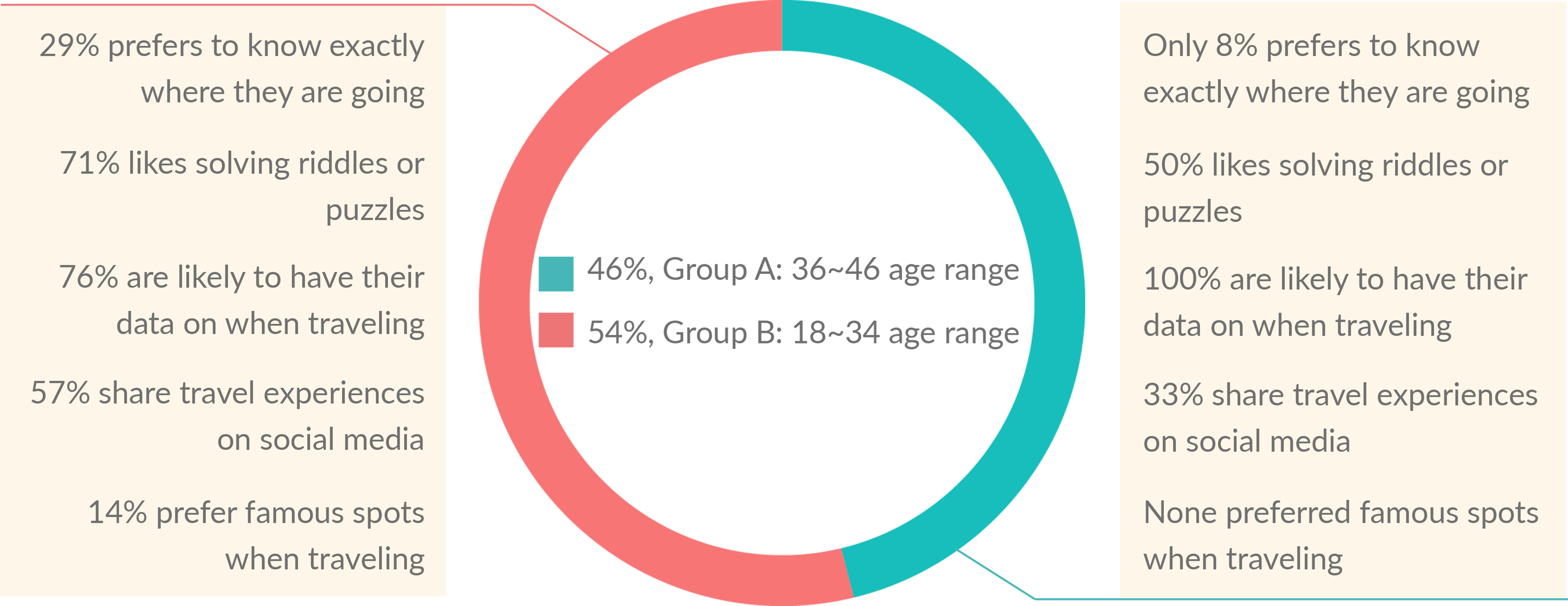
Regardless of age group
- 96% has some form of planning for their travels
- 81% search information about a question or discovery on the spot when traveling
- 85% uses the GPS when navigating
- 81% have not played a scavenger hunt game when traveling. However, 91% of those respondents said a game would help learn more about the city.
User Interviews
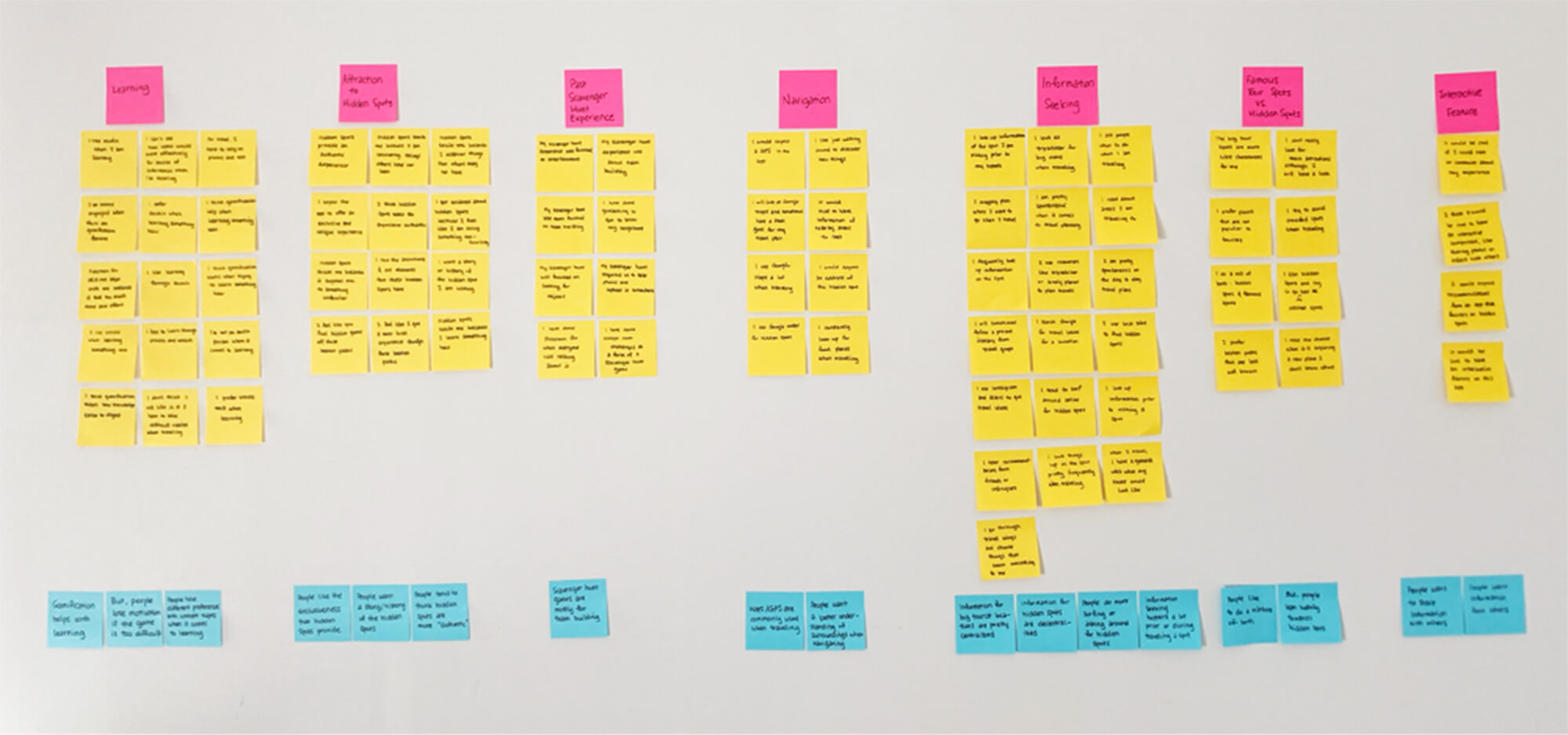
4 individuals were interviewed, and based on their feedback, an affinity map was created. A total of 7 categories (pink post-its) were created to group the different observations and quotes from the interviews (yellow post-its), which were further synthesised into insights (blue post-its).
Personas & User Journey
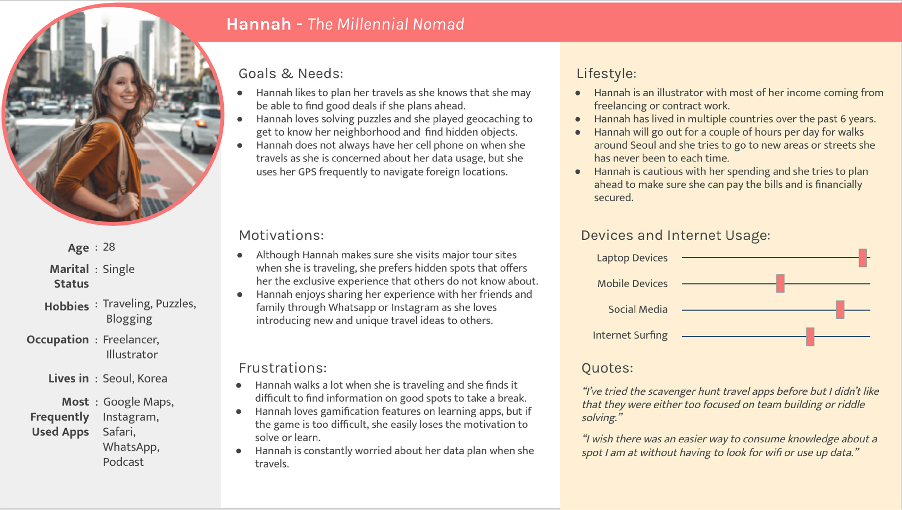
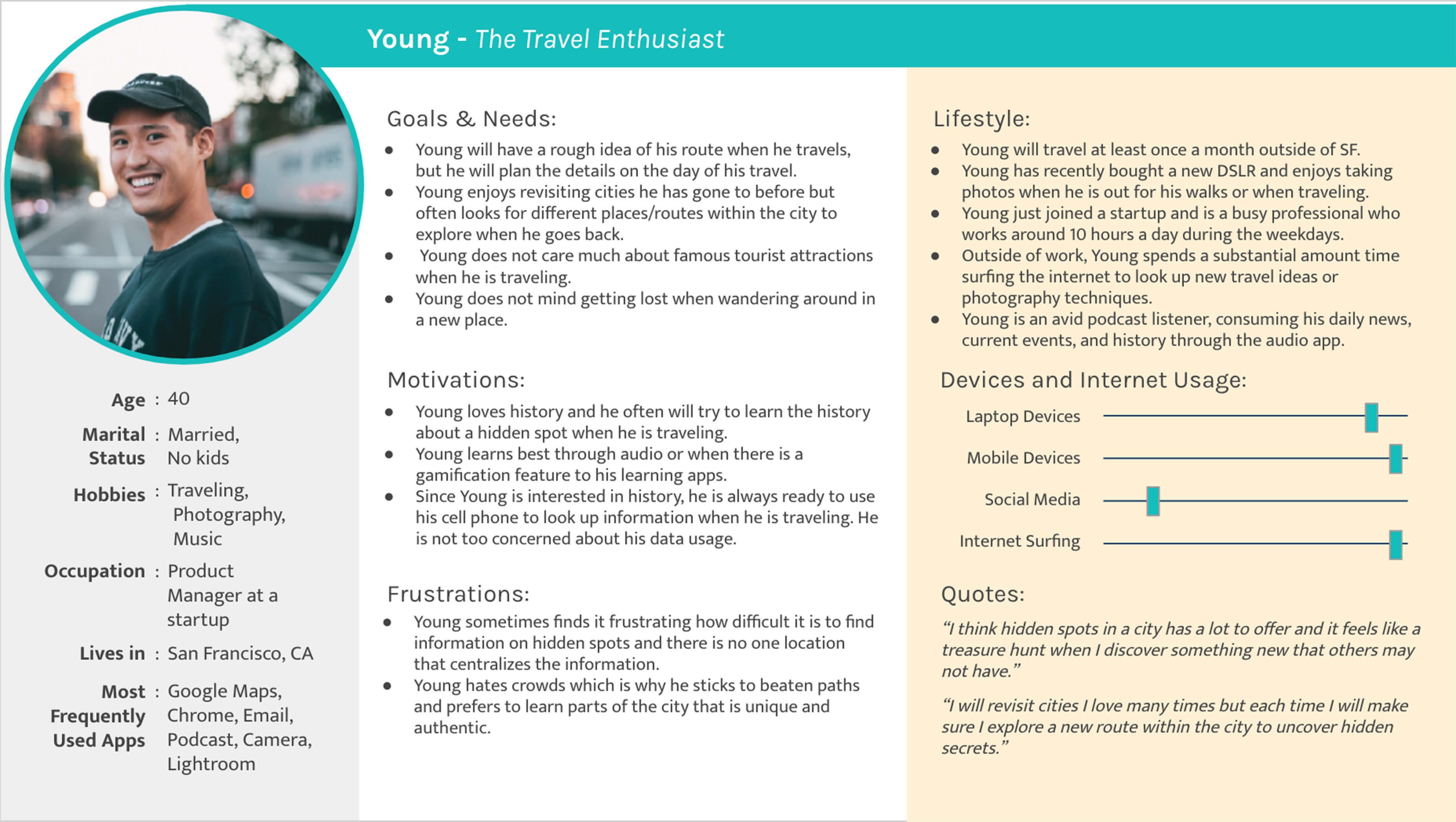
2 personas were developed as a result of the survey and user interviews. User journeys for each of the persona were also developed based on the persona’s goals & needs, motivations, frustrations, and lifestyle.
4 User Flow
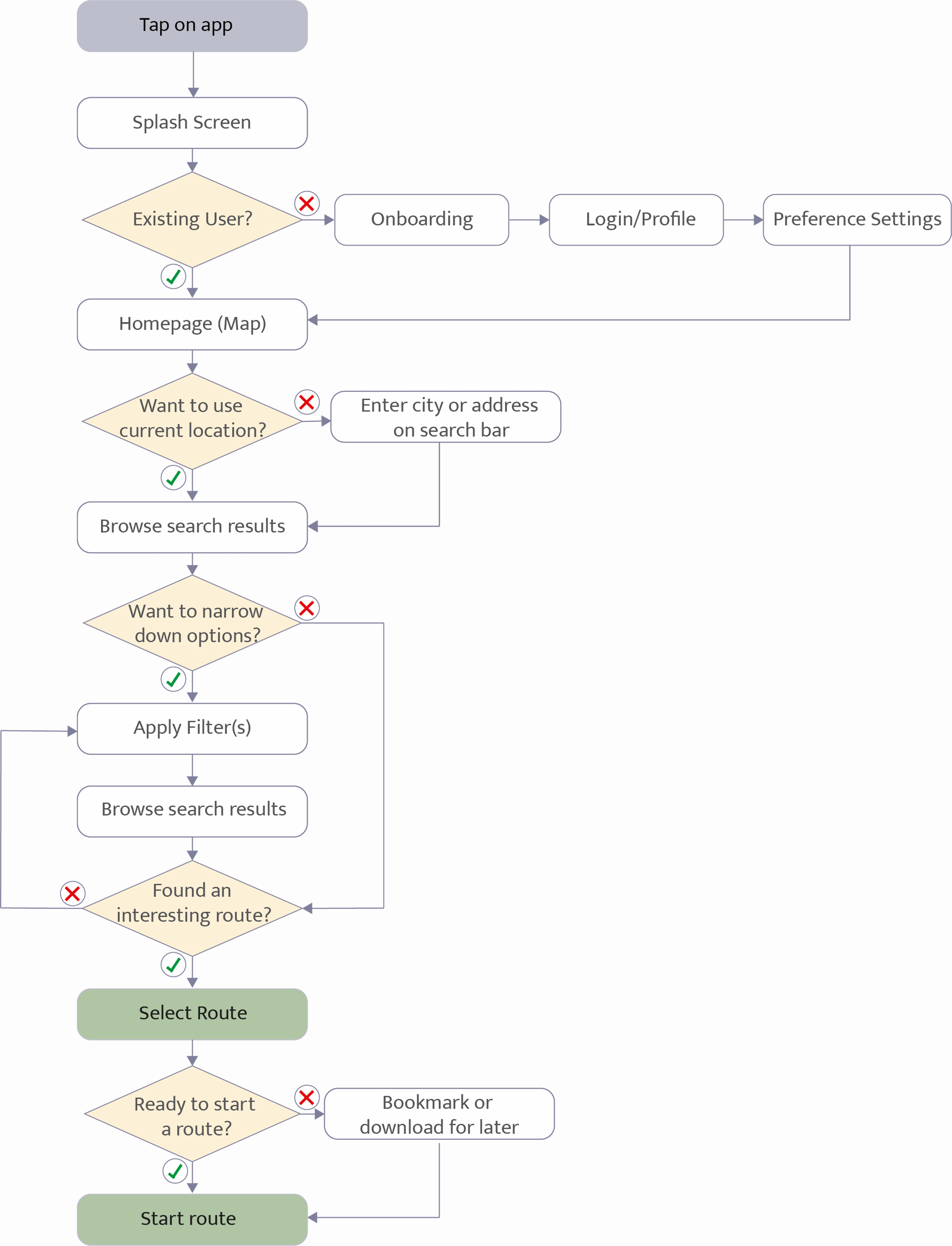
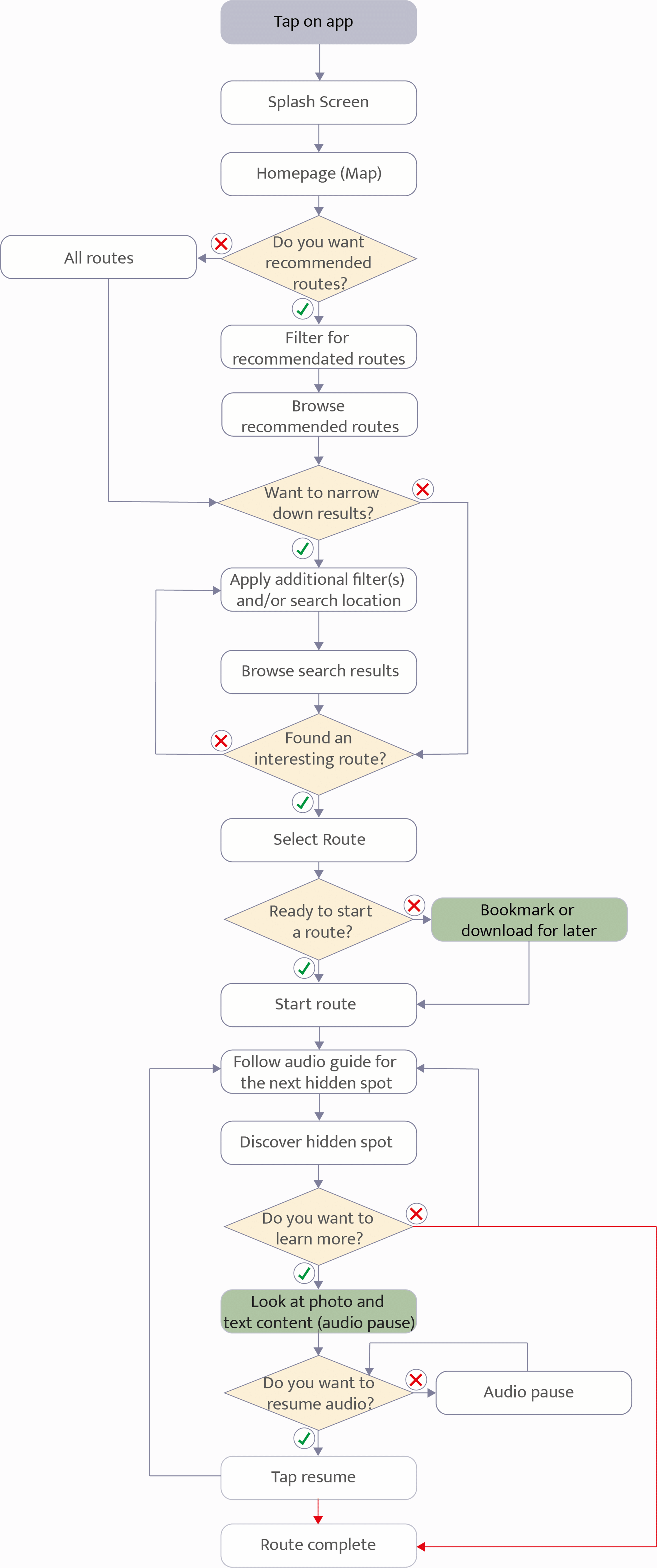
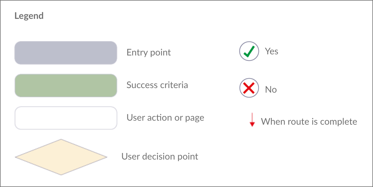
User flows for each persona were defined based on the hypothetical journey map which was a reflection of their anticipated behaviour and thinking.
Hannah's User Flow
Young's User Flow
5 Information Architecture
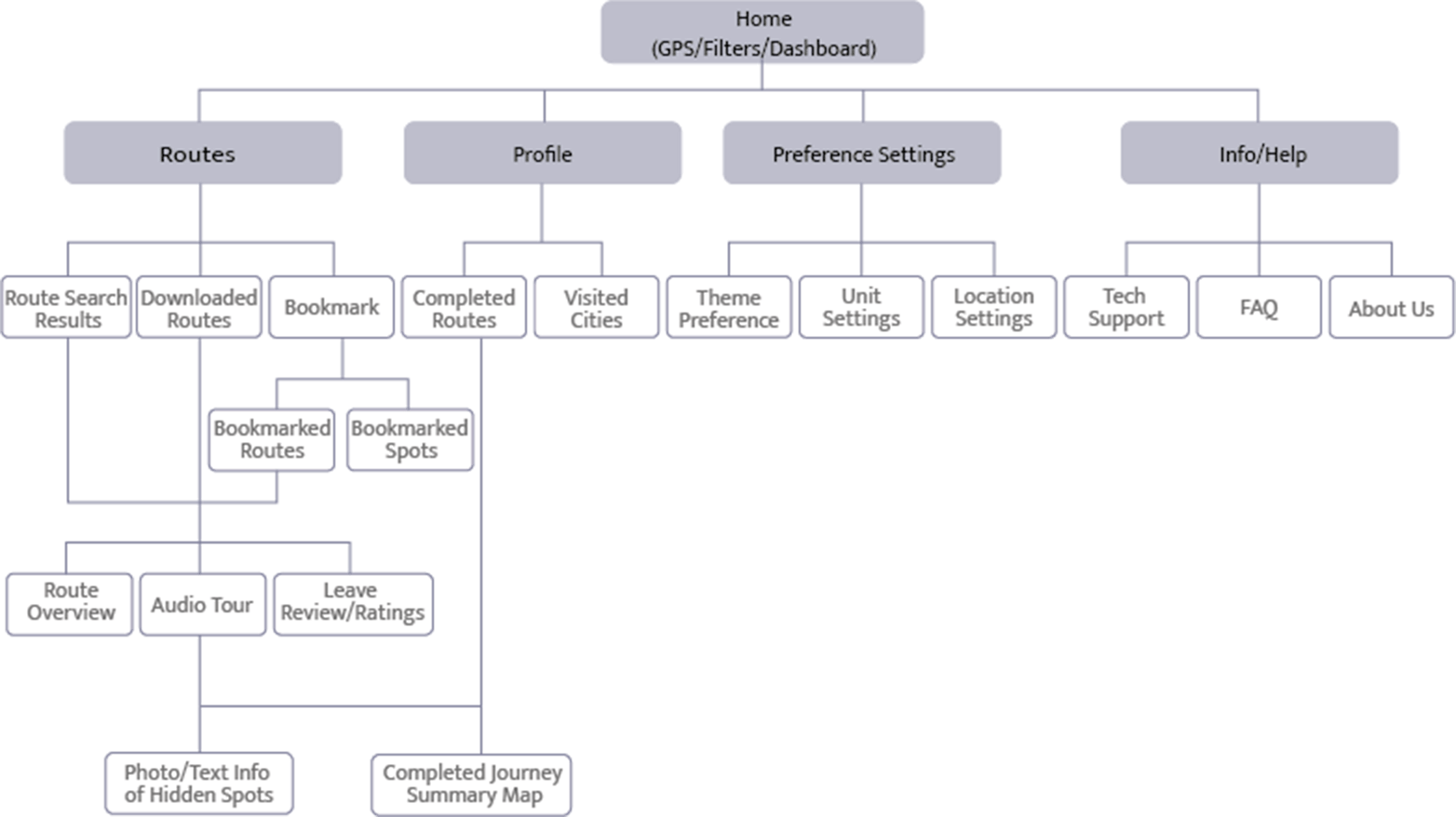
Initial Draft
Initial draft of the sitemap was based on the user journey and user flow from the previous phase of the design process. There were 5 main navigation categories: Home, Routes, Profile, Preference Settings, and Info/Help.
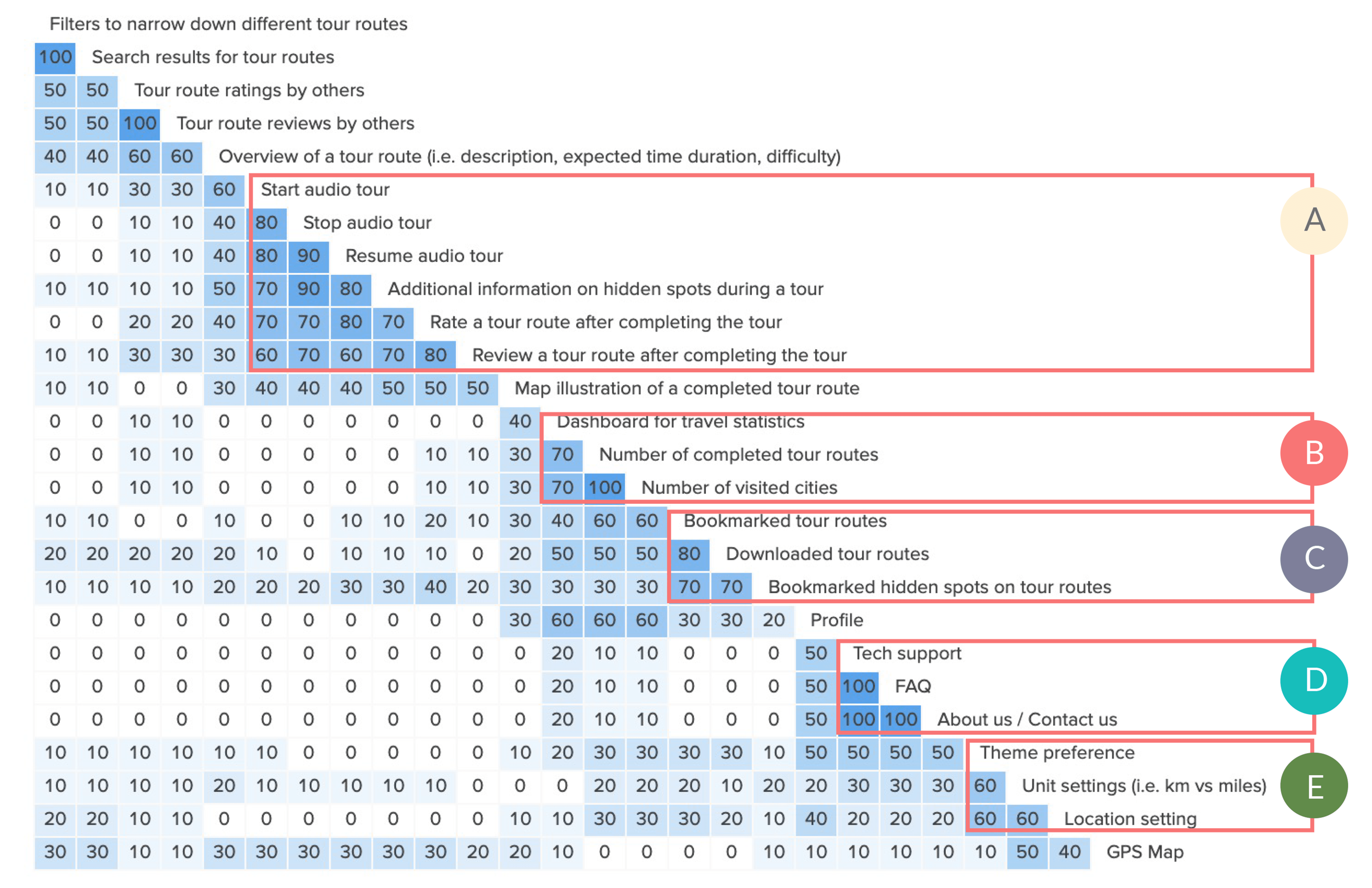
However, since the initial draft was based on a hypothesis, an open card sorting was conducted to build the Information Architecture based on how potential users would actually categorise the different elements.
There were 26 cards in total and the summary of the analysis is as follows:
Insights
-
 Sections planned for “Routes” were grouped together by participants.
 -
 Participants anticipated that “Number of completed tour routes” and “Number of visited cities” would fall under travel statistics.
 -
 Participants grouped the three together indicating that they should fall under the same category.
 -
 Sections planned for “Info/Help” were always grouped together by participants.
 -
 Cards related to settings were not grouped together as much as one would expected. The idea is to have these settings control the filters for a customised experience which is difficult to explain through a card sorting activity. User testing will provide more insight.
Conclusion
There were no major discrepancies on the groupings of cards compared to the original site map. However, there was a question of how sections were labelled. For example, instead of “Route”, participants seemed to consider this section related to a personalised experience. Revisions were made based on this insight.
Revised Sitemap
There were multiple revisions to the sitemap with insights based on the card sorting results. One key learning was not only just the importance of a personalised experience but how the labels can reflect such experience.
- “Routes” section became “Favourites” as most participants mentioned bookmarks and downloads related to a personalised experience.
- Route Search Results moved to the same hierarchy as the filters as participants considered both as search functions.
- Users are provided the option to bypass “Favourites” if they wanted to start an audio tour from the route search results.
- Instead of having travel statistic defined as “Profile”, the label changed to “My Trips” to further add the sentiment of personalisation. “Profile” instead became the label for settings as the card sorting results showed that people have a pretty strong association between “Profile” and settings.
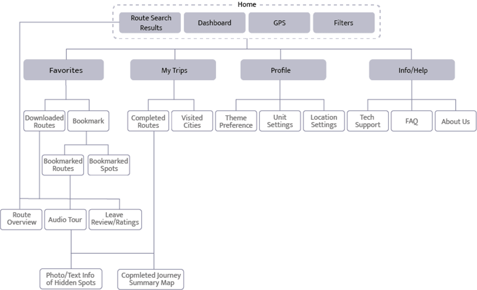
Final Sitemap
Although revisions were results based on the card sorting results, the “Favourites” section required users to click multiple times to reach the audio tour that they have bookmarked or downloaded. Since the audio tour was an essential feature of the app, this was not ideal. In order to solve this issue, Bookmarks and Downloads were brought one level above to the main navigation which reduces an extra step for the users.
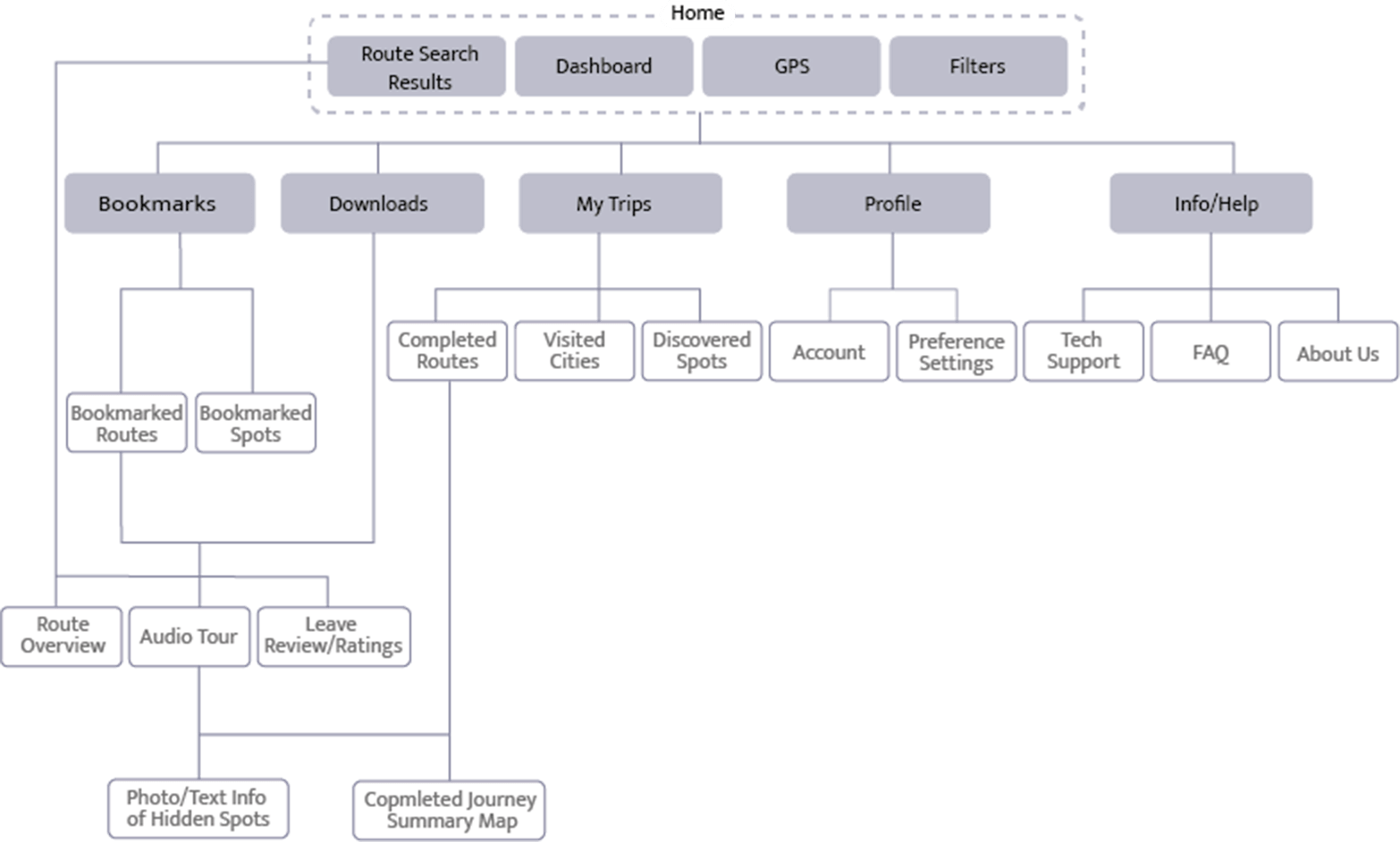
The information architecture took several iterations based on both hypothesis and user research.
6 Wireframes
The initial wireframes and prototypes were developed for two tasks:
- Scenario 1: Searching and downloading routes
- Scenario 2: Getting a recommended list and bookmarking a route.
Scenario 1

Scenario 2

7 Prototype & Mid-Fidelity
The following are the two tasks on a mid fidelity prototype which was used for the usability testing.
Scenario 1

Scenario 2

8 User Testing
A detailed usability test plan was developed in order to better understand how users interact with the prototype. Issues were analysed and prioritised based on the severity of an error.
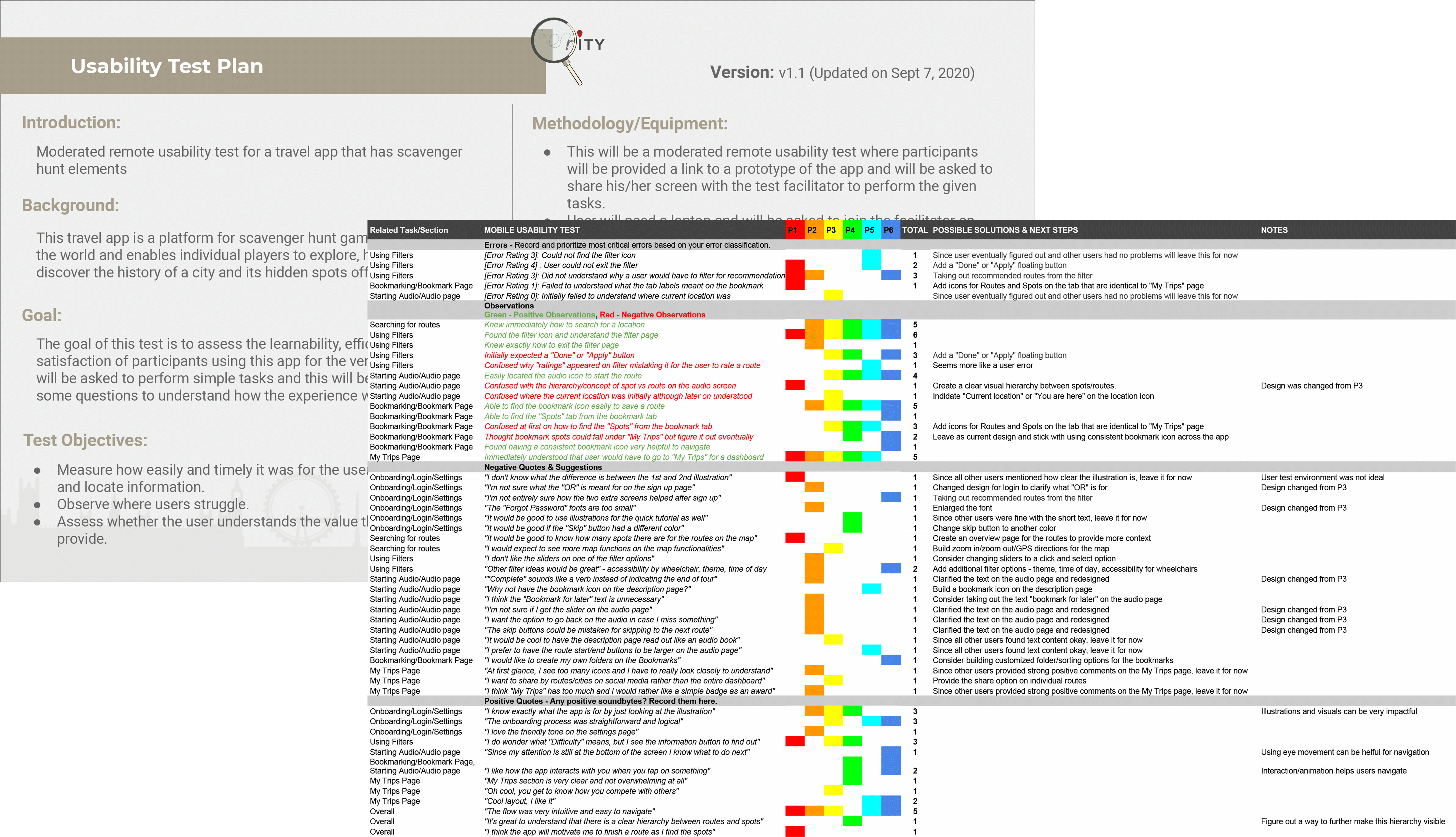
Iterations
Based on the usability test results and high priority issues that were identified, the following changes were made on the mid-fidelity prototype:
Filter Page
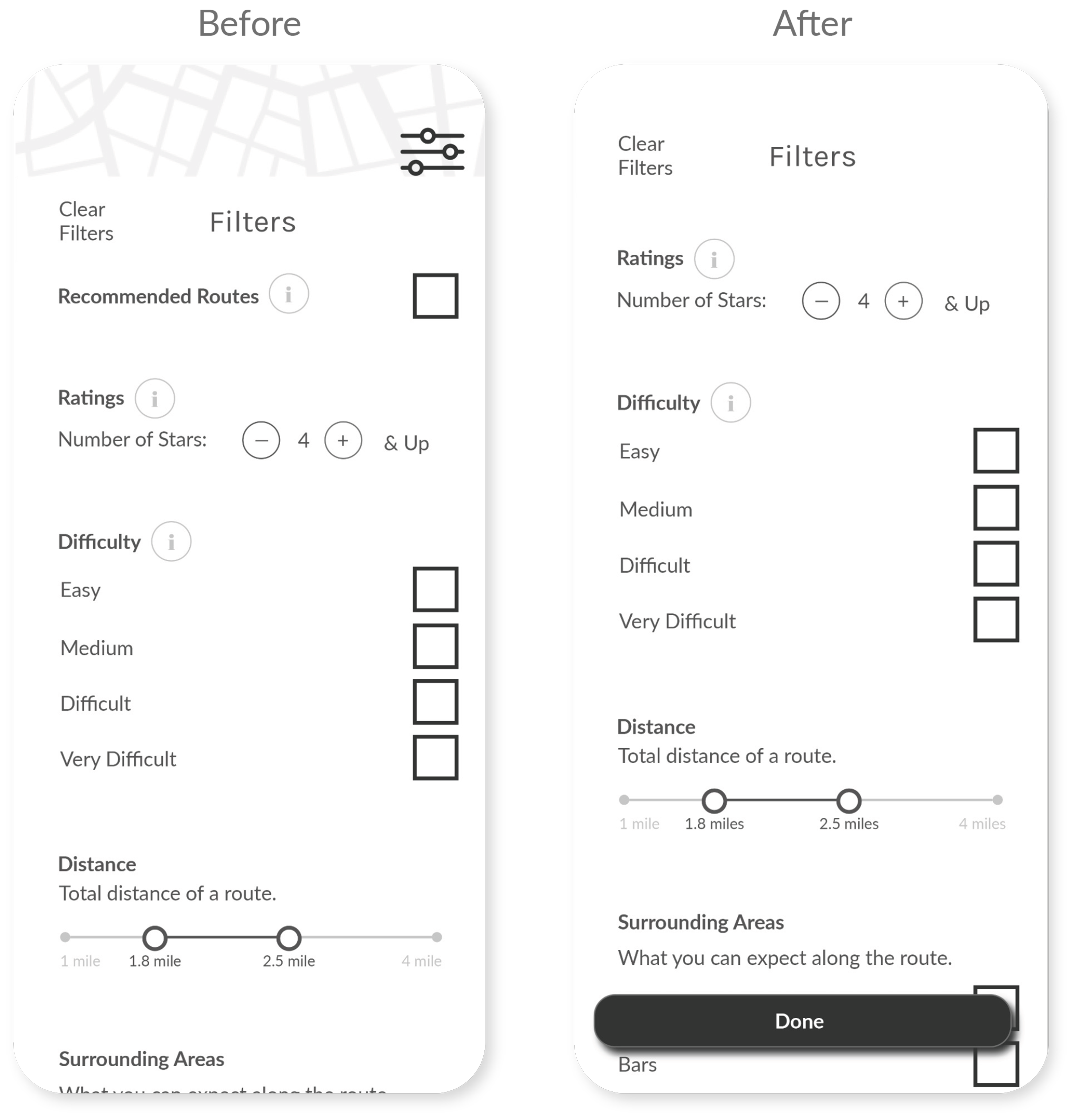
- Added a “Done” button to allow users to exit.
- Took out “Recommended Routes”
Homepage
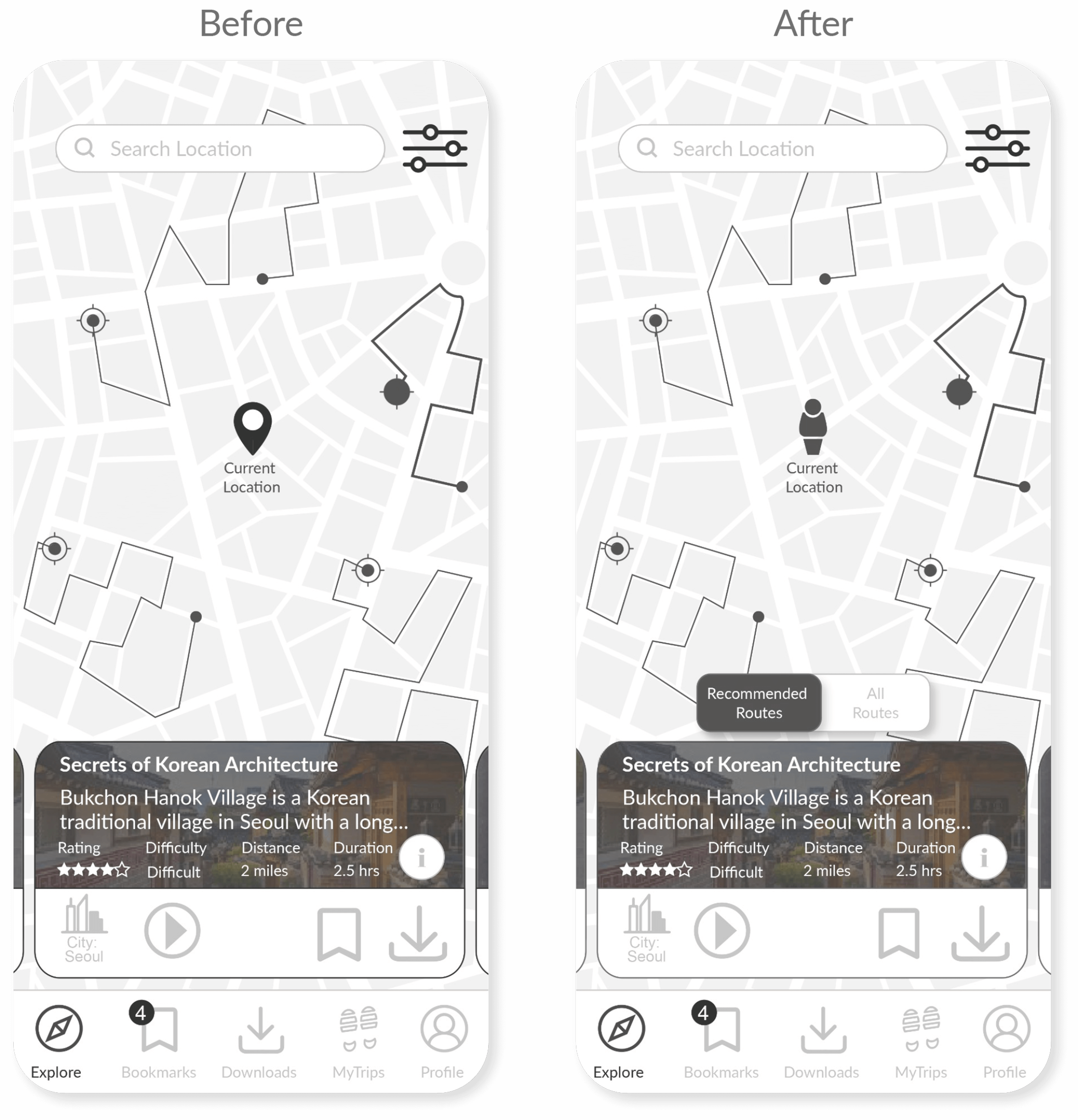
- Recommended routes became a default on the Homepage
Bookmarks Page
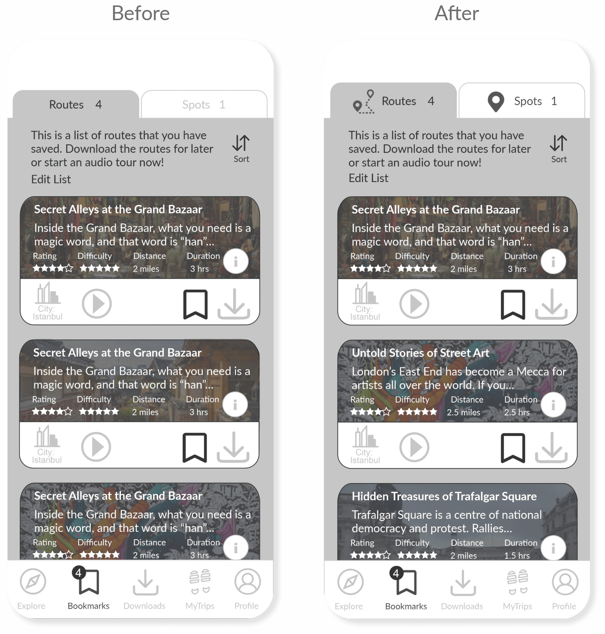
- Icons were used to visualise hierarchy between Routes and Spots
Audio Page
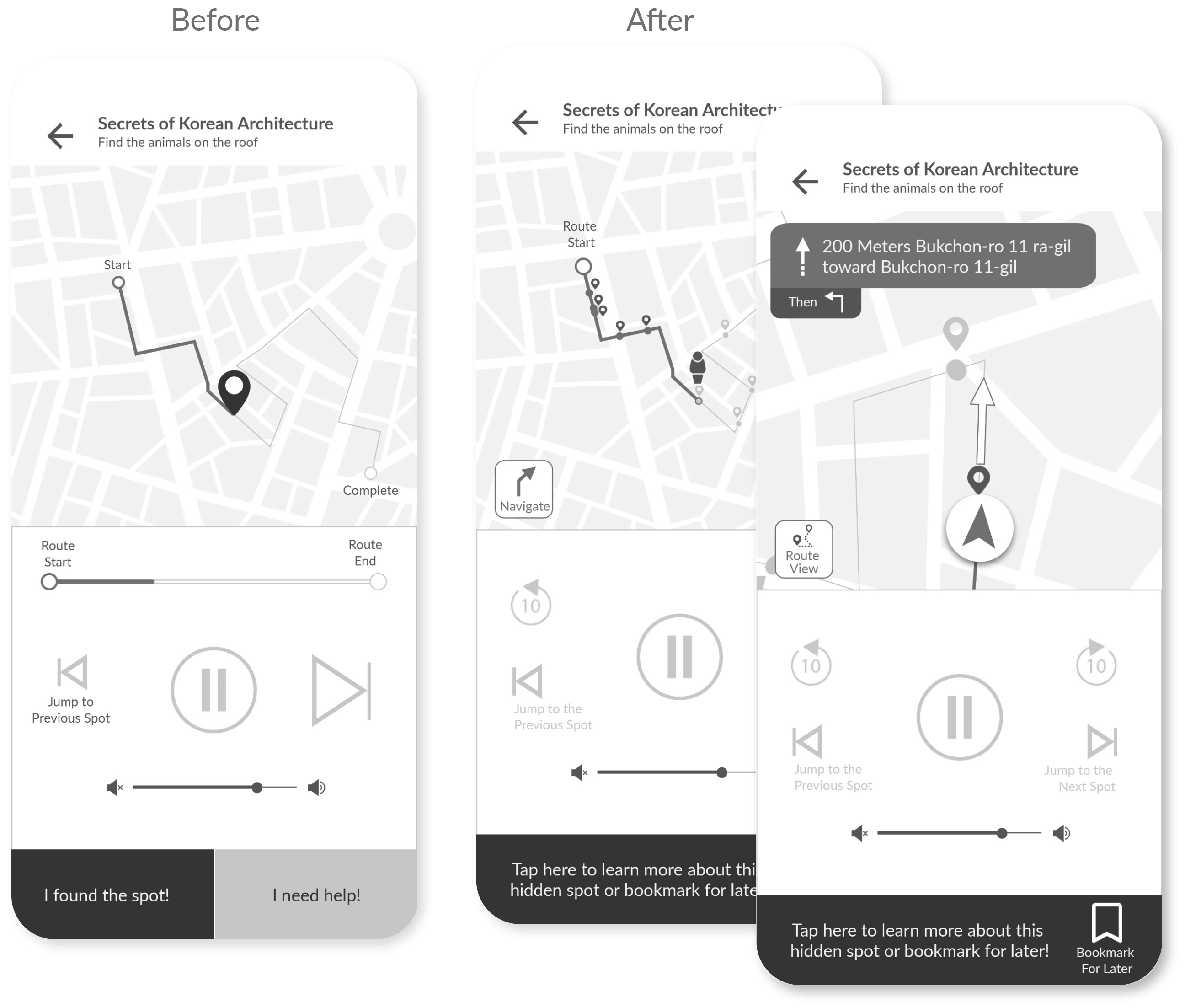
- Modified UI elements on the map to illustrate the hierarchy between Routes and Spots
- Added navigation function on the map
More Iterations for High-Fidelity Prototype
As part of the iterative design process, there were further changes to the design based on user feedback which included preference tests as well. The following are a couple of the tests that took place that made some significant changes to the design:
Dark/light Mode Preference Test
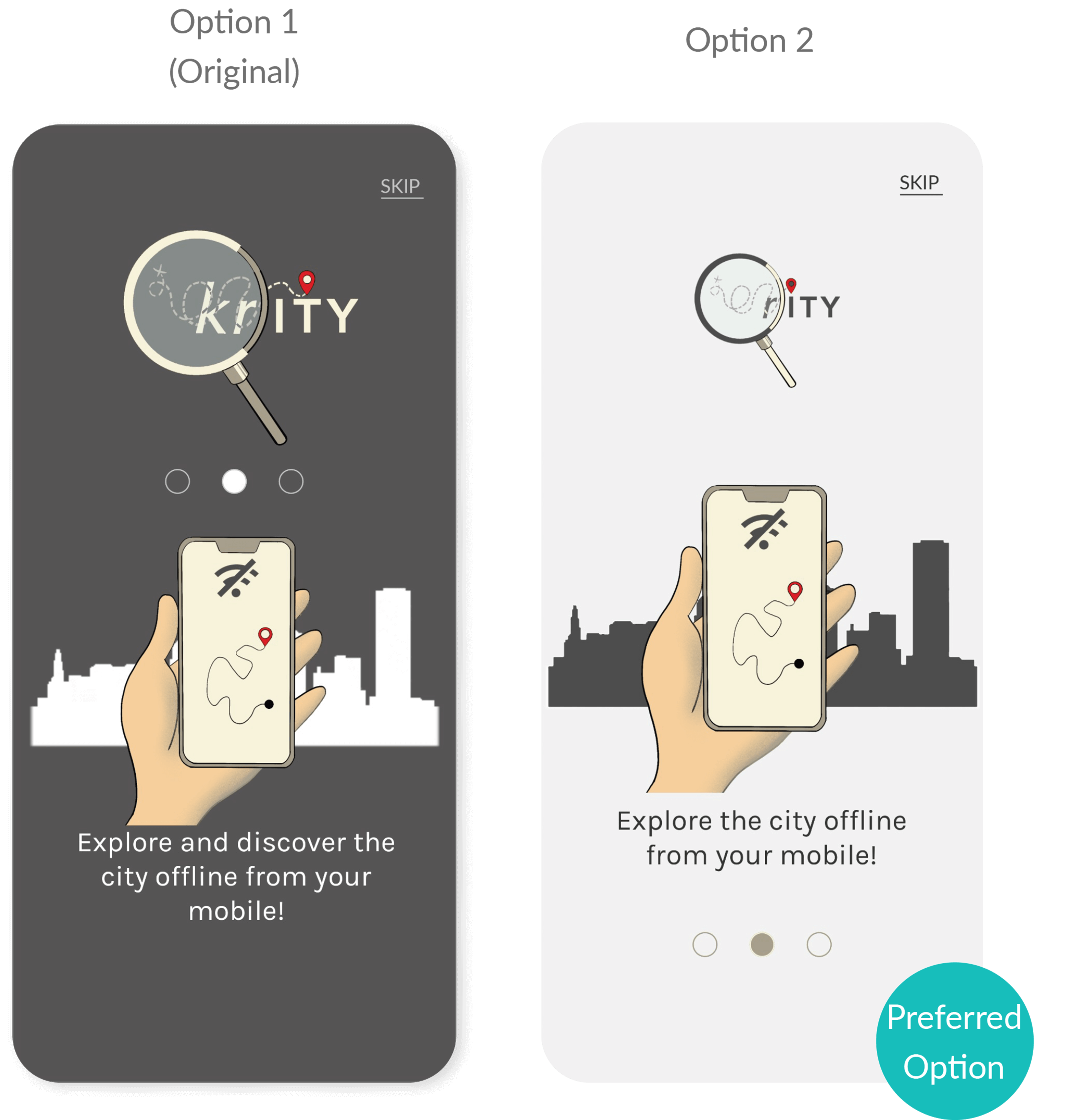
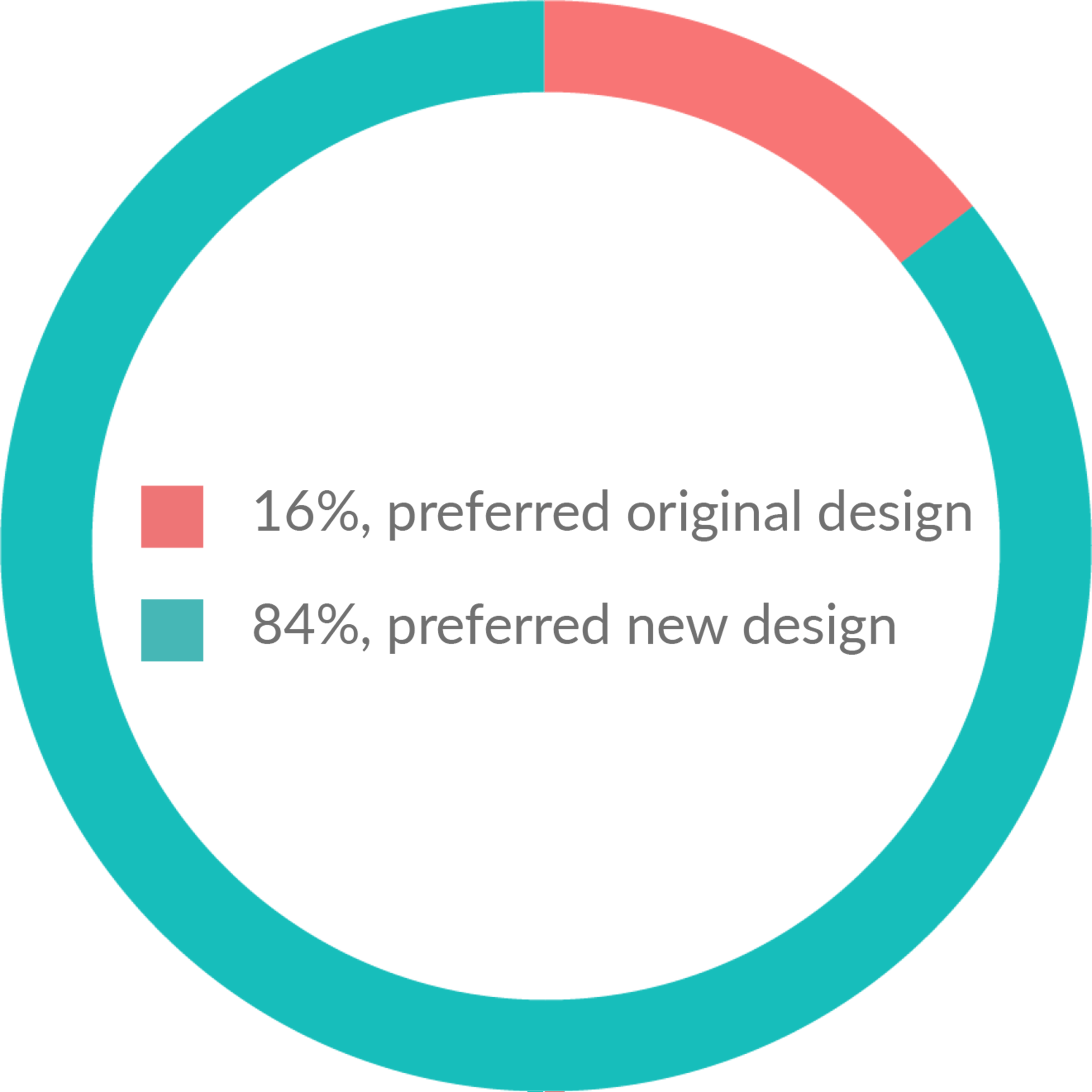
Some of the common reasons why people preferred option 2 were:
- Feels lighter
- Feels more friendly
- Feels more inviting
- It’s more clearer and cleaner
- The other designs feels like it’s an app for night time
A light mode was designed for all the onboarding/settings pages based on the results.
Route card designs
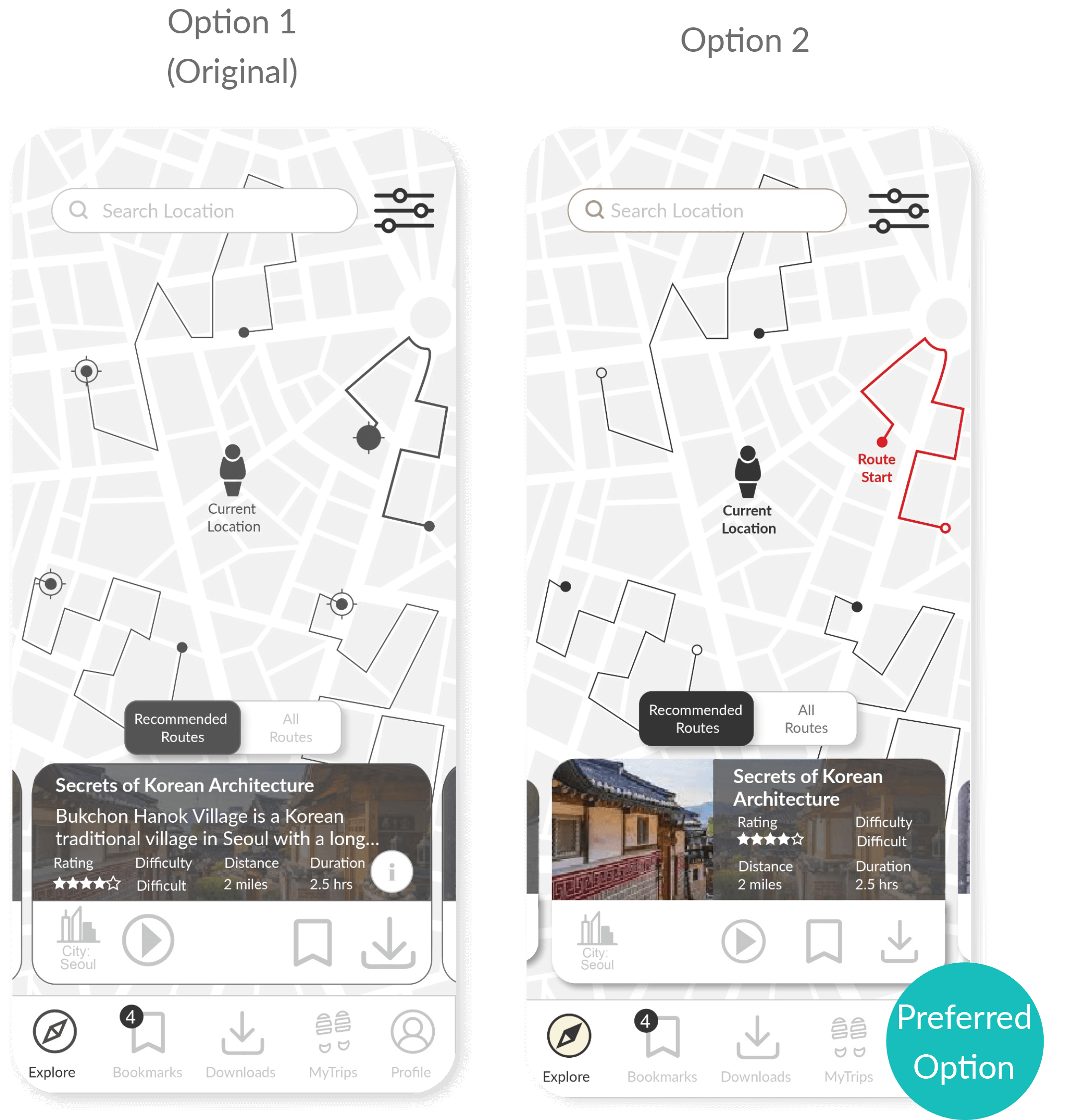
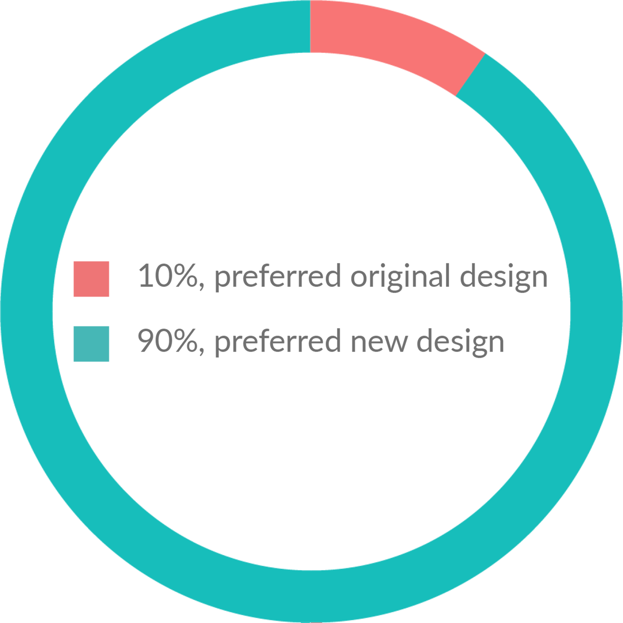
Some of the common reasons why people preferred option 2 were:
- I like to see the picture
- It’s more engaging
- Prefer the images to get a feeling of where I am going
- Looks neater
- It’s more structured
Images were made visible on route cards and only key information was displayed based on the results.
10 High Fidelity
Here are some of the key features and callouts on the design decisions:
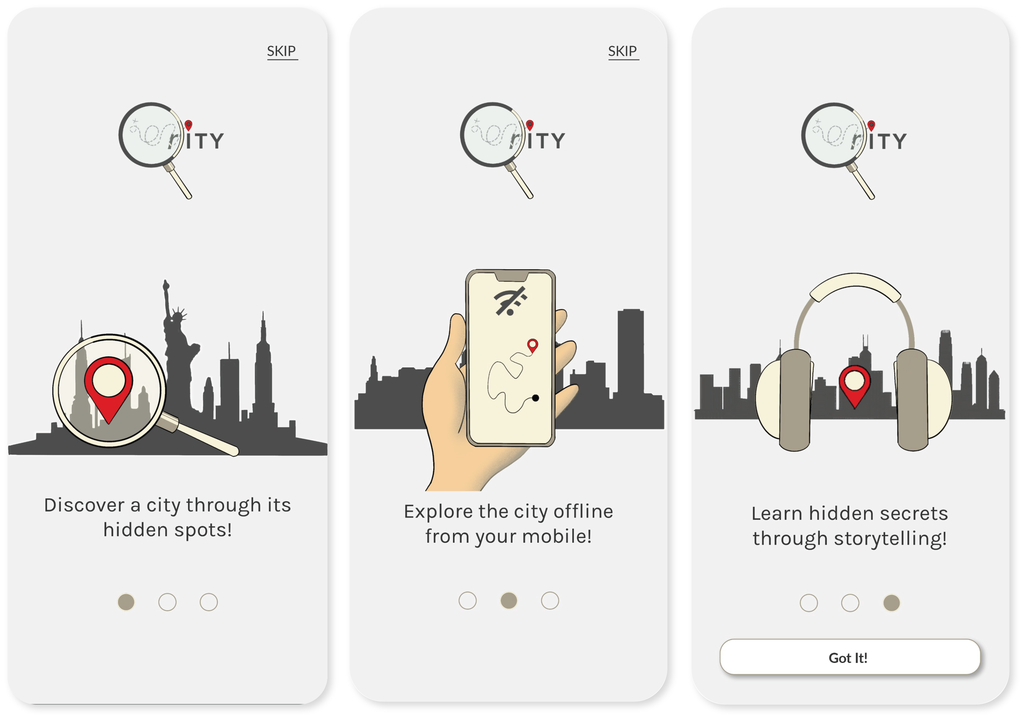
Onboarding
- Hand-drawn illustrations are used to describe the key features and benefits of the app.
- Onboarding pages are kept short to 3 pages with minimal text to keep content engaging.
- The original onboarding screen was changed from dark to light mode, and the size of the logo was reduced to help keep users focused on the content rather than the branding.
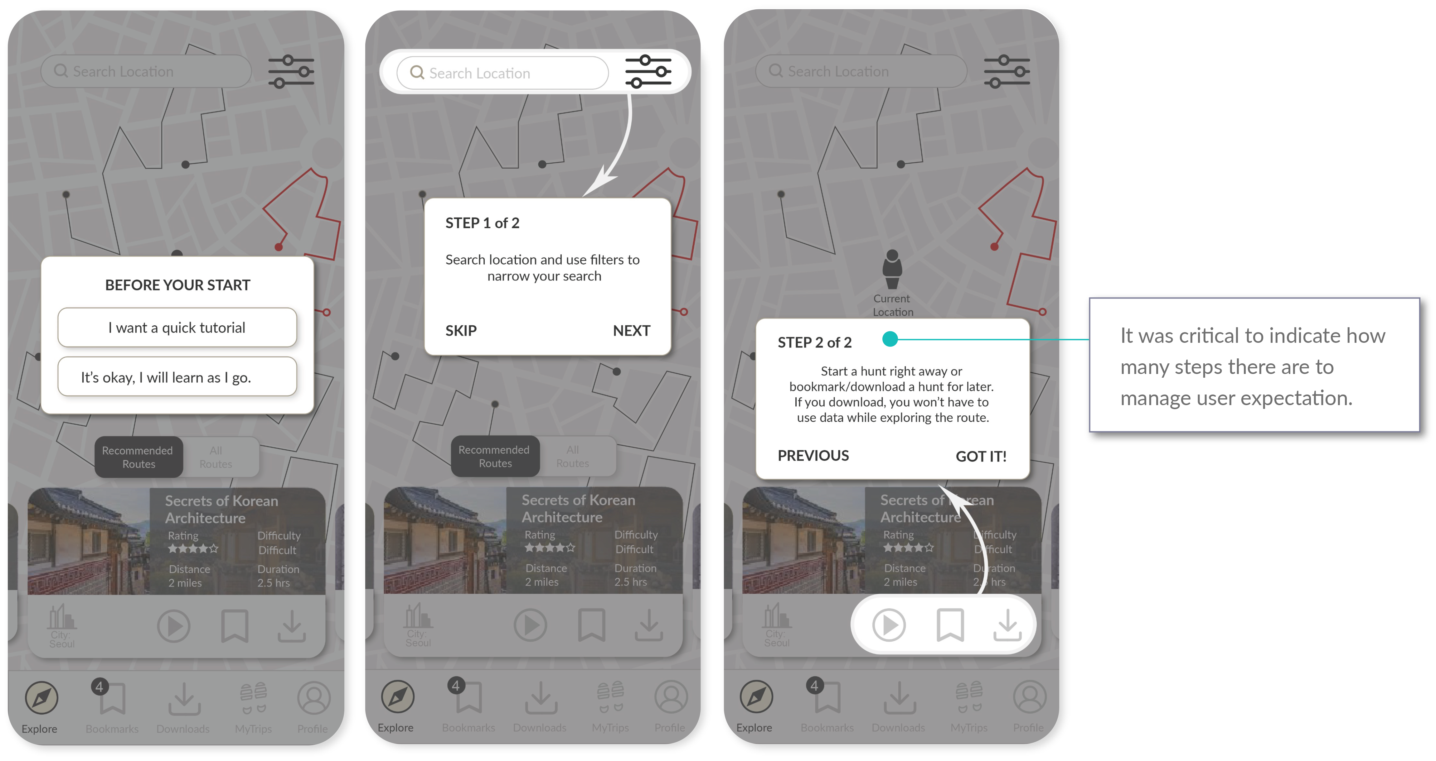
Tutorial
- Tutorial is kept short to 2 steps and provides users the option to skip and learn as they go.
- The radius of the dialogue box corners were reduced to ensure users could tap on the different options without issues.
Recommended Routes
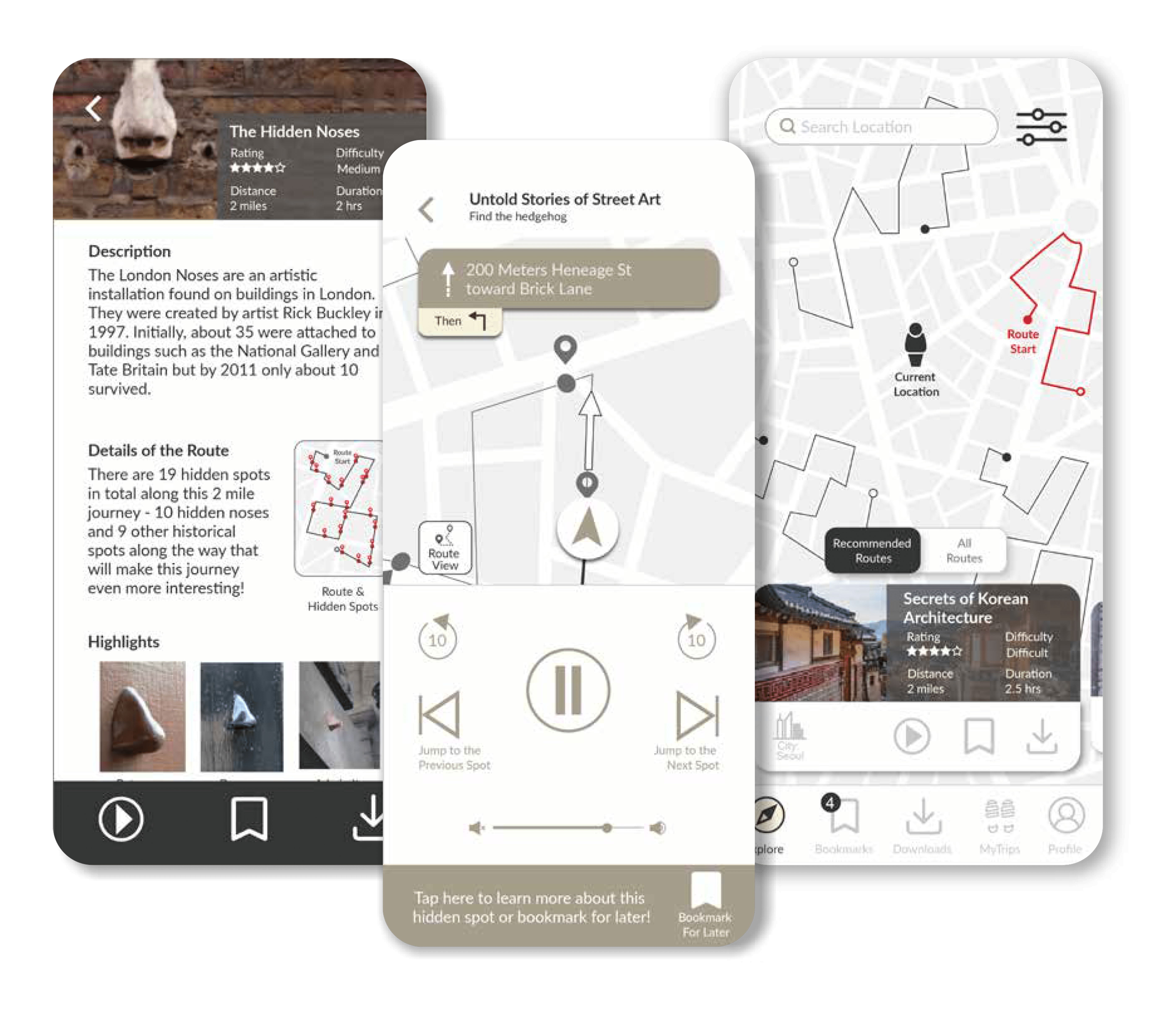
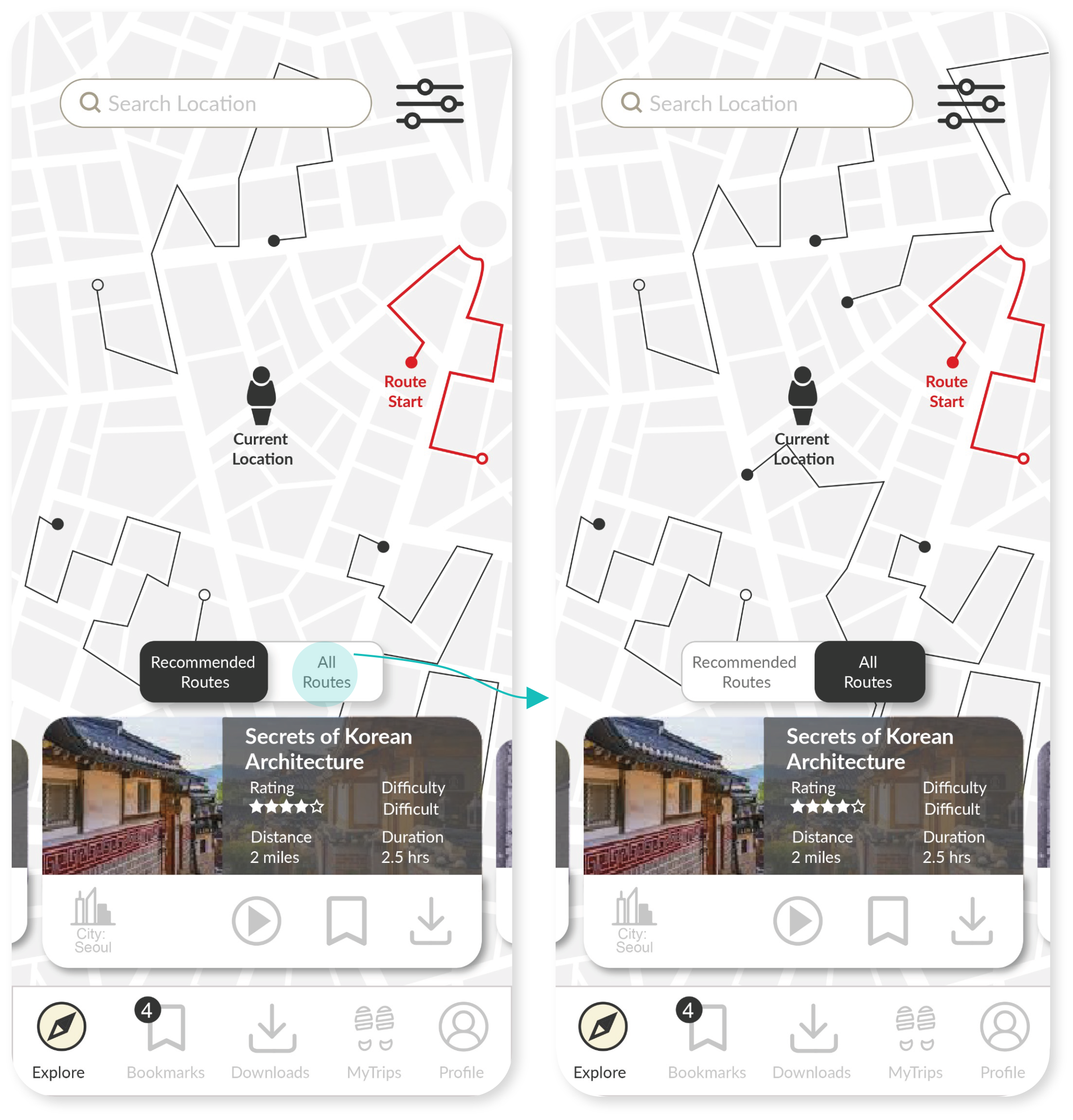
- Recommended routes for users display as a default on the Homepage, and users can easily toggle to “All Routes”.
- In the original design, users would have to go to the filters to select recommended routes, but the usability test results revealed that users expect to see recommended routes by default without having to use the filter function.
Filters
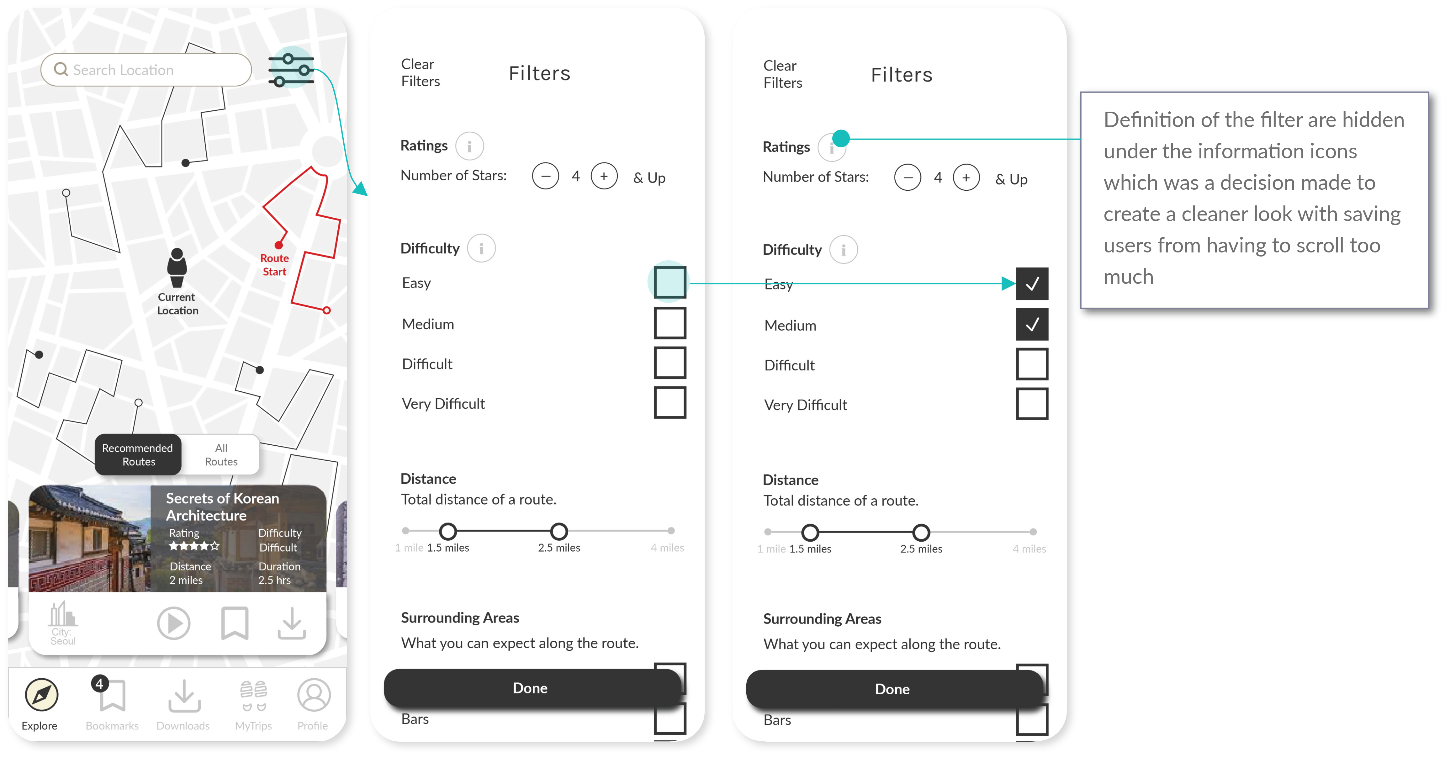
- Filters are an important feature to the app as it relates to a personalised experience for the users.
- Most of the filter options are based on user interviews on what they would expect for a personalised experience on a scavenger hunt/travel app.
- Descriptions of each filter were hidden under the “i (information)” icon to allow a cleaner look, and a “Done” button was added to easily exit the page.
Location Search
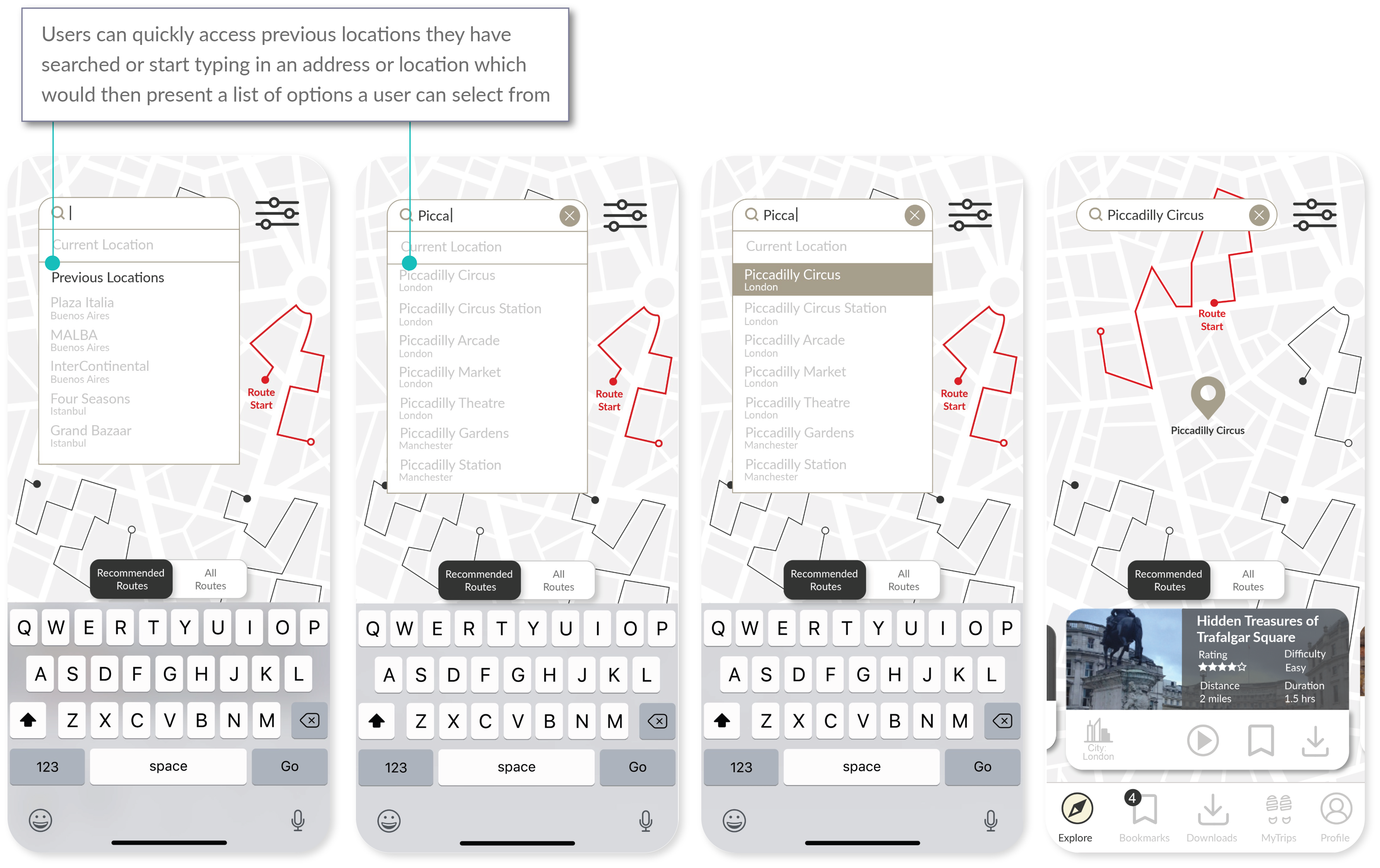
- Location search replicates common search functionalities used in GPS applications. This was critical because searching for a specific location is a widely used feature for mobile users.
- Users can quickly access previous locations they have searched or start typing in an address or location which would then present a list of options a user can select from.
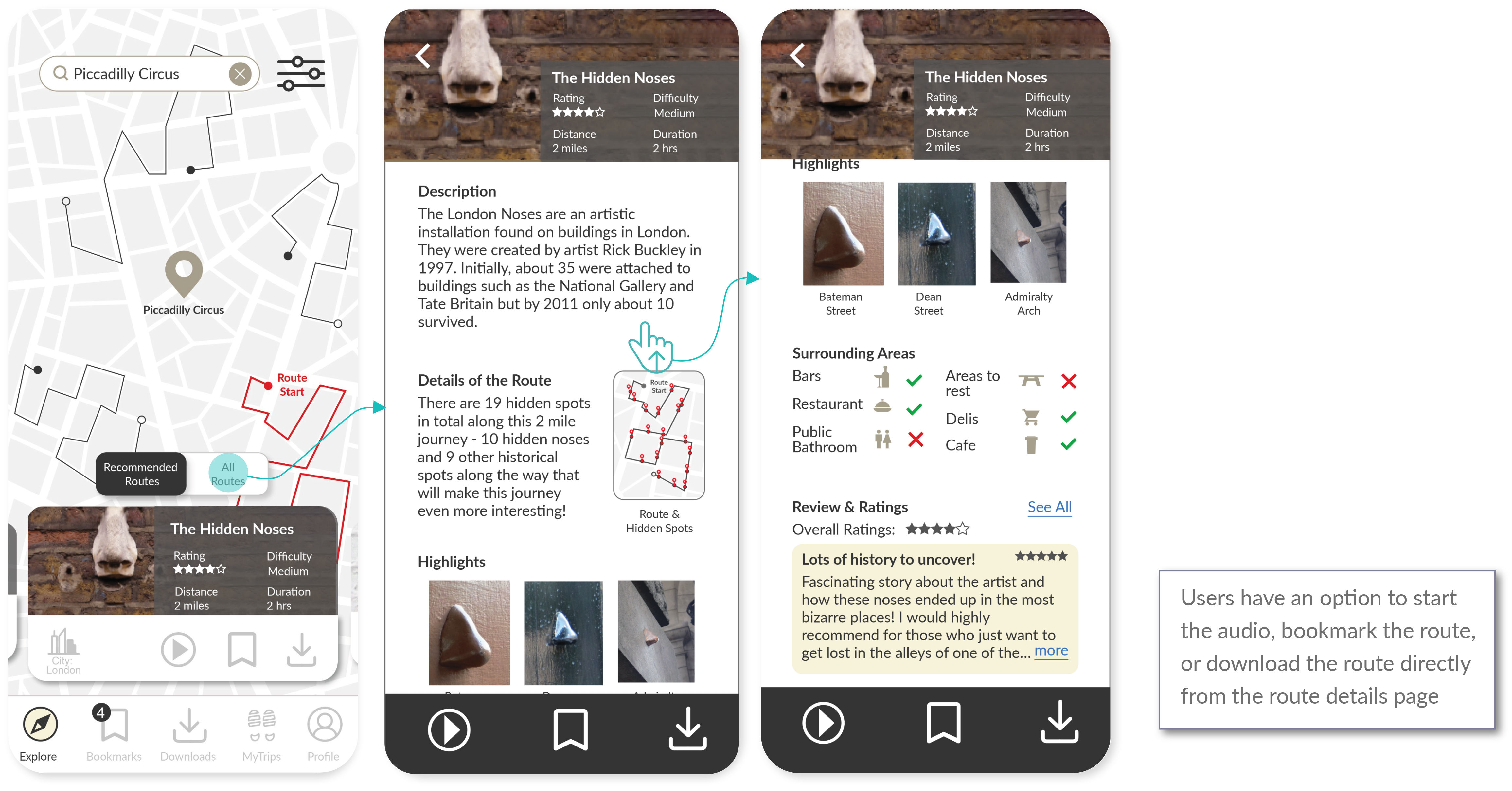
- Once a location is searched and selected, users get search results of different routes and the details of the routes from the route cards.
Browsing Routes
- From the map, users can access information of where the route is in relation to the location they have searched.
- Route cards are displayed as a carousel where users can swipe left/right. The route card that appears on the screen corresponds to the route highlighted (in red) on the map. Users can also tap the route on the map to get the corresponding route card.
- Tapping on the route card brings the user to a detail page of the route.
- Users have an option to start the audio, bookmark the route, or download the route from the bottom of the route details page.
Bookmarking/Downloading a Route
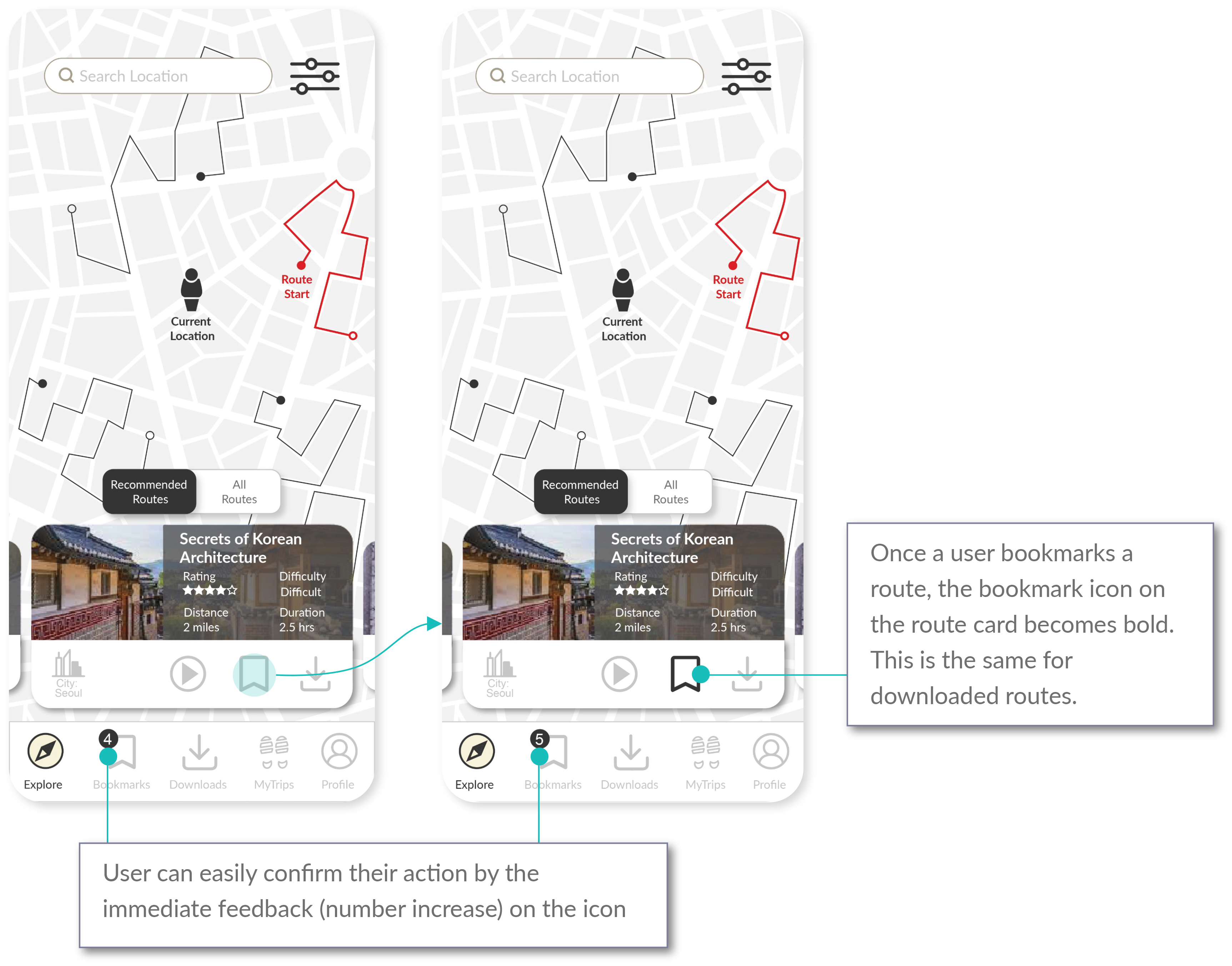
- All route cards will have a series of options users can take: playing the audio, bookmarking a route, and/or downloading a route. This is to provide an easy way of organising the route(s) based on users’ preferences.
- Once the user taps on an icon either the audio will start playing, the route will be bookmarked, or the route will be downloaded. For bookmarks and downloads, user can easily confirm their action by checking the number increase on the bookmark or download icon at the bottom navigation bar.
- Once the user bookmarks or downloads a route, the bookmark icon or the download icon on the route card will become bold, confirming the users’ actions. Users can simply tap on the icons again to undo the action.
Bookmarks
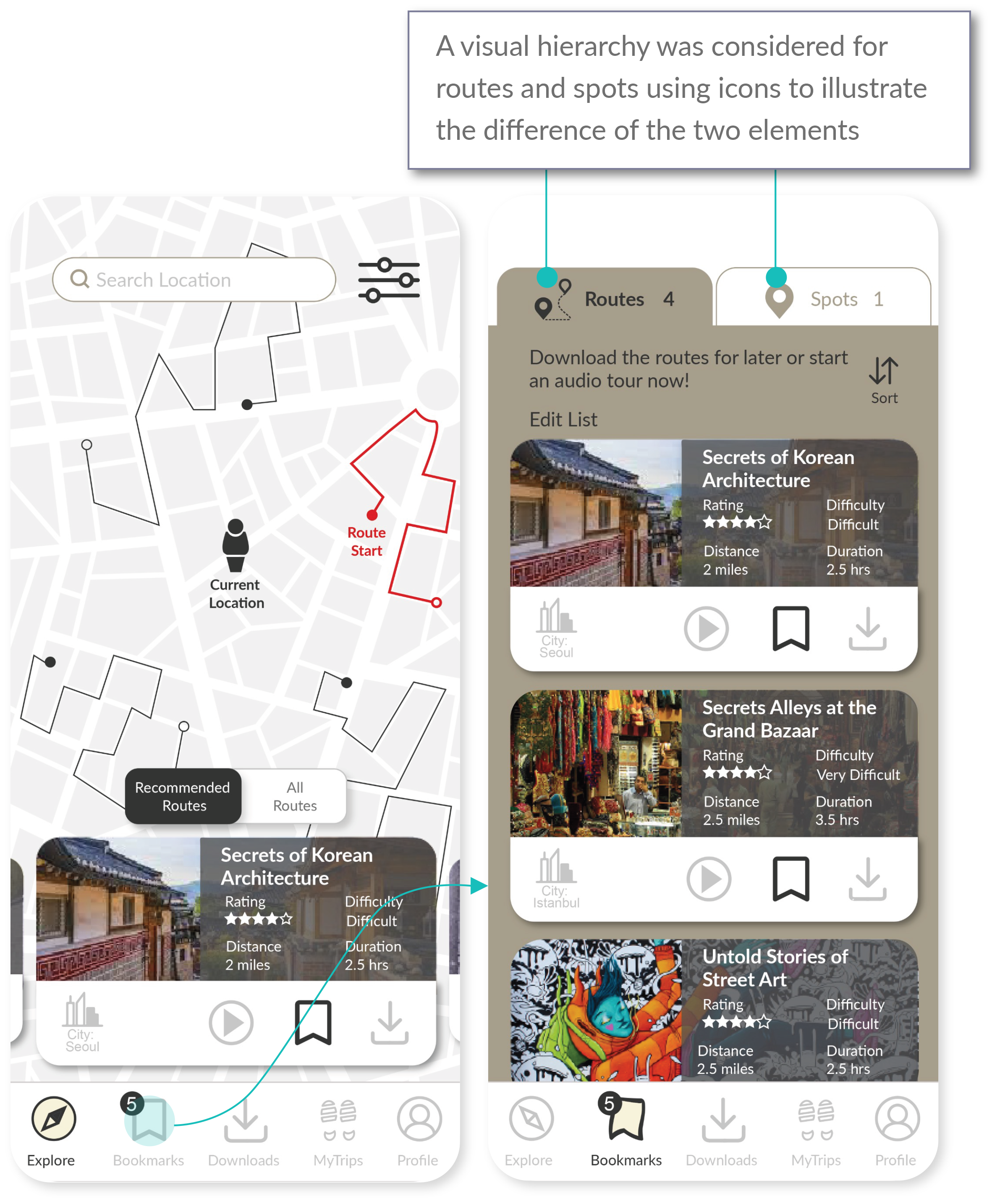
- The bookmark icon on the navigation bar takes users can access bookmarked routes.
- The “Bookmarks” page has two tabs: 1) bookmarked routes, and 2) bookmarked spots. Bookmarked spots will be covered later.
- A visual hierarchy is used for routes and spots using icons.
- From the “Bookmarks” section, a user can start an audio or download the route.
Summary and Dashboard
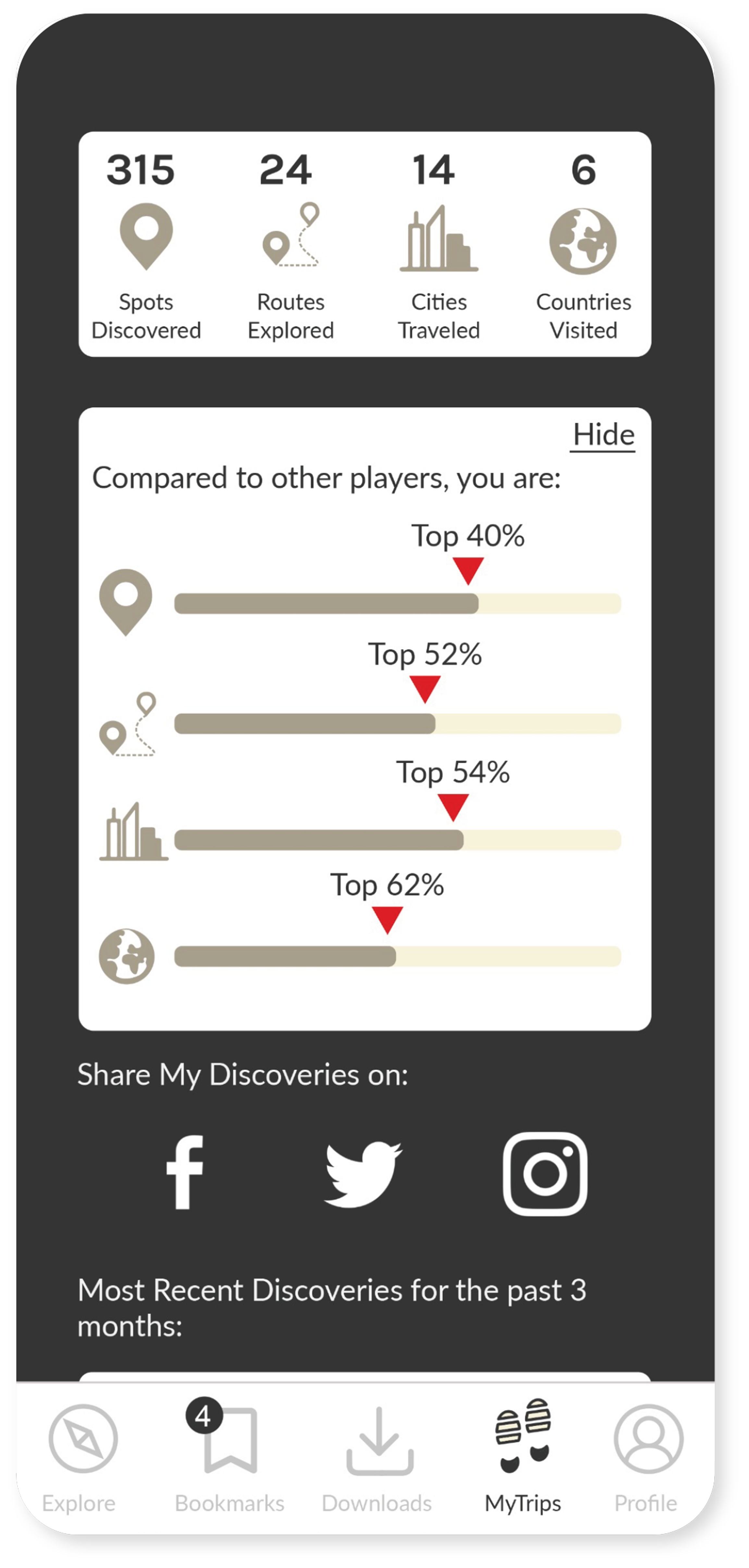
- Users can get a quick statistics of their travels.
- There is a gamification feature on the dashboard to illustrate how the user compares with other players.
- Users can share their experience on social media.
Audio Map View
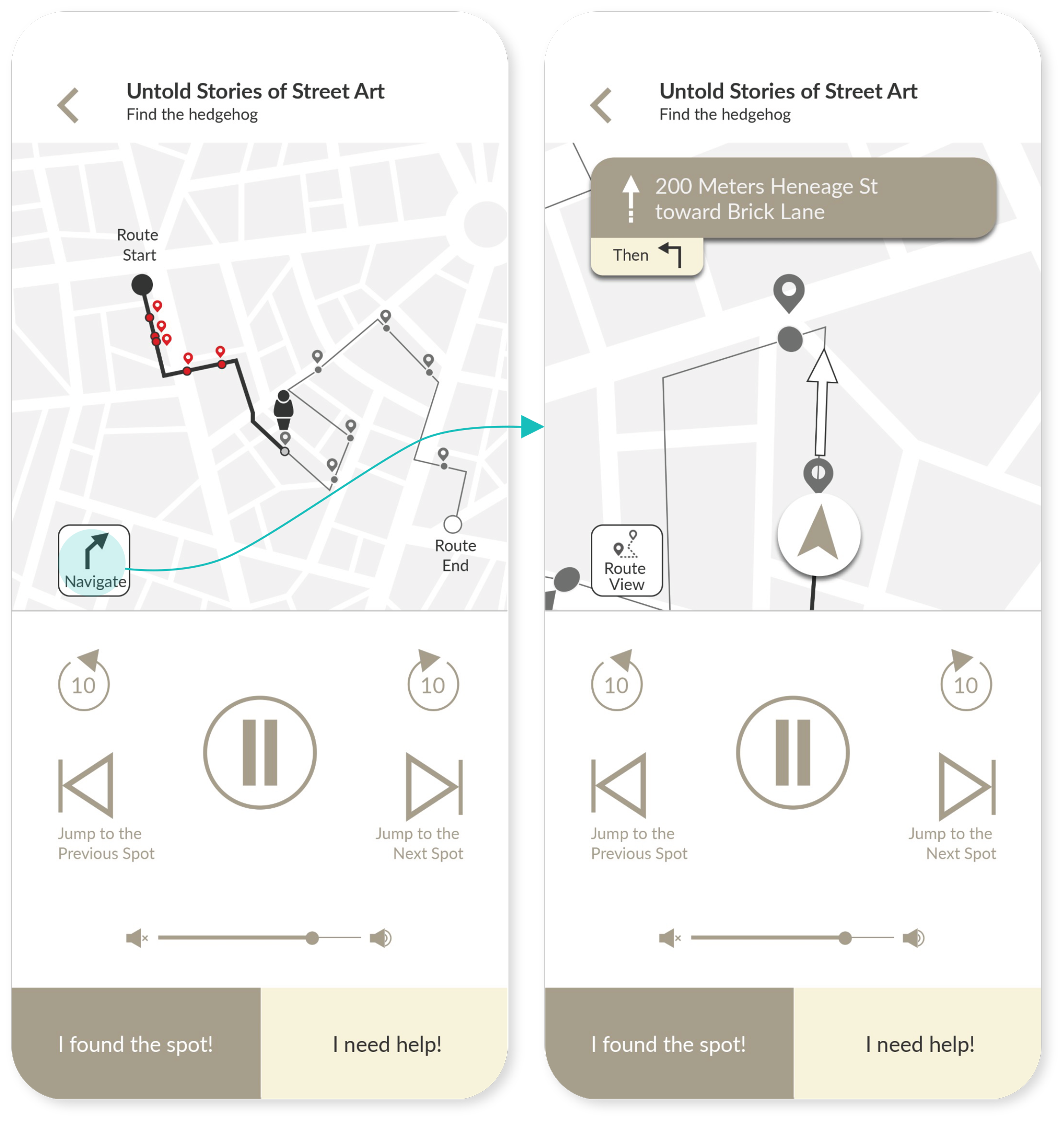
- Once users tap on the audio play button from a route card, they land on the audio page which has universal audio features such as a play/pause button, 10-seconds back/forward buttons, and skip buttons which enables users to jump to the previous or next spots on the map.
- Users can access two types of map view. One is an overall view that displays all the spots along the route the user is on. The other is a navigation view where the app guides the user with directions. This is a feature that is commonly used on GPS applications.
Spot Discovery
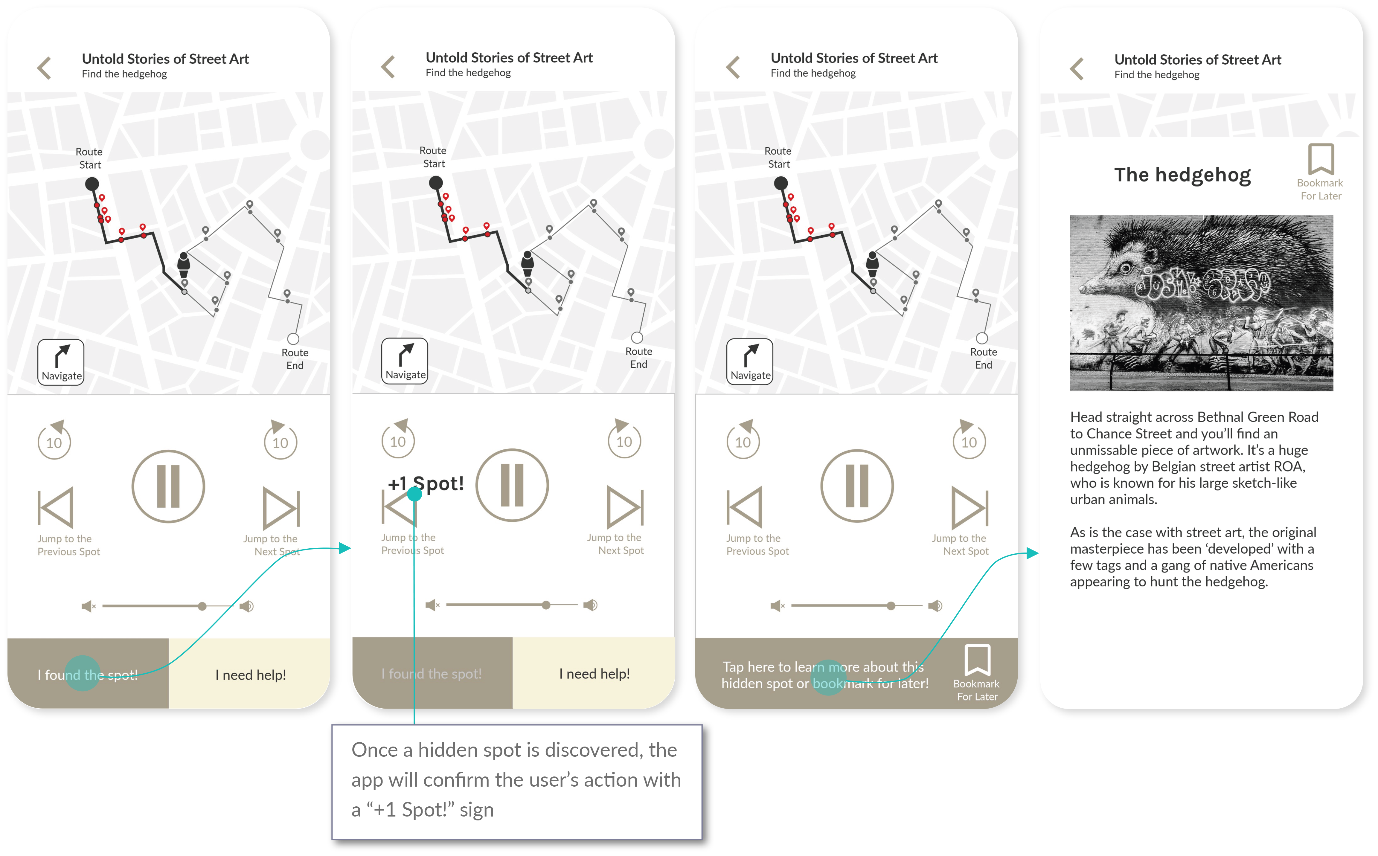
- As the audio guides the user to hidden spot locations, the user is presented with two options: 1) an option to tap on “I found the spot!”, which will confirm a user’s action with a “+1 Spot!” sign, 2) an option to get help if user is lost.
- Once user finds a hidden spot, user then has an option to find out more about the spot.
Bookmarking Spots
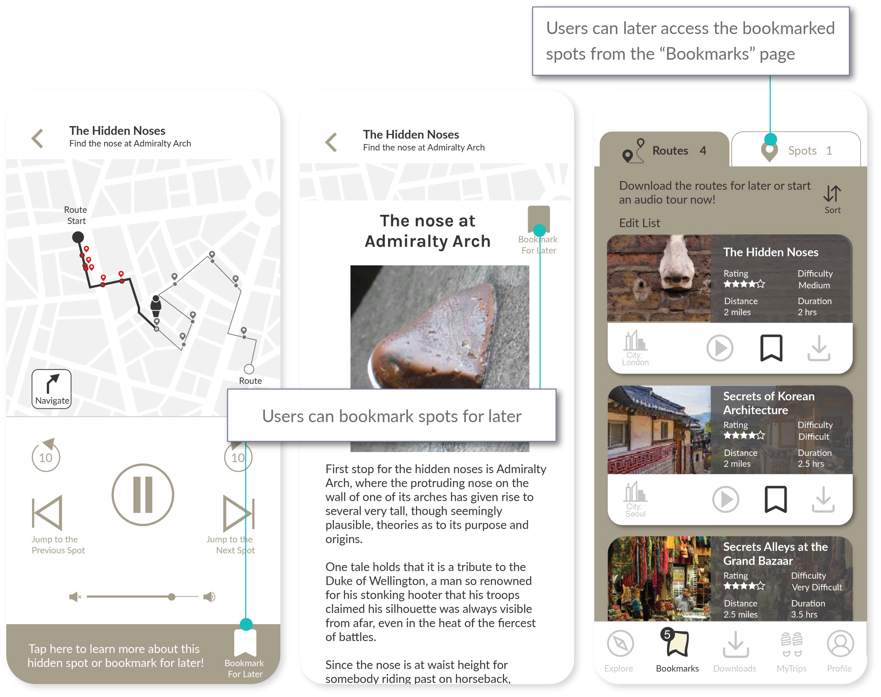
- Users may want to save the details of the spots for later. In such case, users can either bookmark the spot from the audio page, or the spots details page.
- Users can later access the bookmarked spots from the “Bookmarks” page.
Final prototype
11 Final Thoughts
There is still a lot of room for improvement for this project. The following are the list of things I would have liked to explore had I been given the time:
Desktop app
While it made sense to create a mobile app that was intended for users who would be traveling on foot, the card sorting results made it clear that test participants categorised travelling in 3 phases: pre-travel planning, during travelling, and post-travel debriefing. Pre-travel and post-travel can potentially involve a lot of browsing, reading, and writing compared to the actual travelling phase. Behaviourally, this could mean users may prefer planning and debriefing using their desktops. The hypothesis would need to be researched and tested, but if hypothesis is proven to be true, a desktop app would make sense. There will have to be some consideration of what features to include on the desktop app as the actual scavenger hunt features during the travel phase would not be necessary on a desktop.Filters
During the usability test there were some interesting suggestions made by some of the participants for the filter options. This includes ideas such as themed routes or recommendations for the best time of a day to travel the routes. Personalisation is something I would have liked to focus on had there been more time for the project.Customisation for the Bookmarks/Downloads pages
This relates to personalisation as well, but an idea I would like to explore through user testing and surveys would be the option for users to customise folders for the “Bookmarks” and “Downloads” pages. This project was focused on the actual travel phase during the scavenger hunt, but it would be insightful to explore the pre-travel and post-travel activities and behaviours of potential users. Folder customisation would relate more with the pre-travel planning phase and provide users with the flexibility to organise their preferred routes.
Team play mode
The “Team Play Mode” is an option on the settings page in the current prototype, but since the focus of the project was more on the process of discovering routes and hidden spots, the prototype was developed only for the individual game mode. Providing a team play mode can be a way to monetise the app since it would be a unique feature that other competitor types (i.e. travel books, travel apps, walking tours) do not usually offer. I did initially consider charging by the route, but given that other competitor types are already doing this, it made more sense to stick with the idea of monetising from providing a platform for team play rather than the content itself. Had there been more time, developing a user flow and prototype for the team play mode is an idea I would have explored. This would have required much more time as the hypothesis would be that there would be different personas to consider, since the assumption is that the characteristics of people who travel individually are different from those who prefer group traveling. This also means that a complete different set of user flow, user journey, and information architecture under the team play mode would be required.Accessibility for the visually impaired
Accessibility for the visually impaired users is an area that needs more improvement on. The app provides text instead of audio based on user settings, which was mainly considered for accessibility for the deaf or hard of hearing users. However, given that discovering hidden objects/spots relies on the ability to see, considerations for the visually impaired was not included in the scope of this project. There is research to be done on the behaviour, thoughts, and feelings for the visually impaired when travelling which could potentially be an area to explore for this app.
