UX/UI/Frontend Case Study: Cheeky Chae


Responsive website development using HTML, CSS, and JavaScript
Overview
This was a website design & development project with the main goal of demonstrating my work and introducing myself. The design was built with the design thinking principles, and the website development was based on HTML, CSS, and JavaScript.
Contributions
Strategy, User Research, Testing, Information Architecture, Wireframing, Prototyping, Web Development
Duration
Jan 2021 ~ Mar 2021
Challenges & Goals
- Provide a comprehensive site that explains the process of UX, UI, and frontend projects.
- Provide details of my background, work experience, and an easy way for people to reach out to me.
- Create a portfolio that is easy to navigate and responsive to all screen sizes.
Tools Used
Adobe XD, Atom, GitHub, FileZilla, W3 Code Validator, Adobe Illustrator, Adobe Photoshop
1 Information Architecture & Wireframes
Initial Sitemap
Initially, the Homepage became the main page where I introduced myself. My work (UX case studies & drawing) became subsections where users would have to click on a menu option from the Homepage.

Wireframes

Sitemap Iteration
Since the target audience for the portfolio would mainly be those curious about my work, I tried a different approach on how the information was organised. Instead of making myself the focus on the Homepage, decided to display the case studies and drawings to show my work. I also intentionally tried to make the hierarchy as flat as possible.

2 UI Elements & High Fidelity
UI Elements
Since the portfolio was going to be content heavy, simplicity was key for the UI elements. Light and minimal number of colours were used in order to minimise distraction.
Primary Colors
-
#2F7B79
-
#FDF0D5
Buttons & Social Media Icons
Logo (Complex & simplified)
Original illustration was created for the personal brand

Fonts
Karla was used for header elements while Lato was used for the body text. Fonts were displayed mainly in two colours: #5E5E5E & #FFFFFF.

High Fidelity

3 HTML & CSS & JavaScript
Basic Set-up
Atom was used as the code editor. I first focused on writing out all the content on HTML based on the high fidelity mockup. An external style sheet for CSS was created to keep styling consistent and efficient. Most images had two sizes and using the "picture" and "img" elements, the smaller image size was used for mobile to ensure efficiency and less load time on smaller devices.
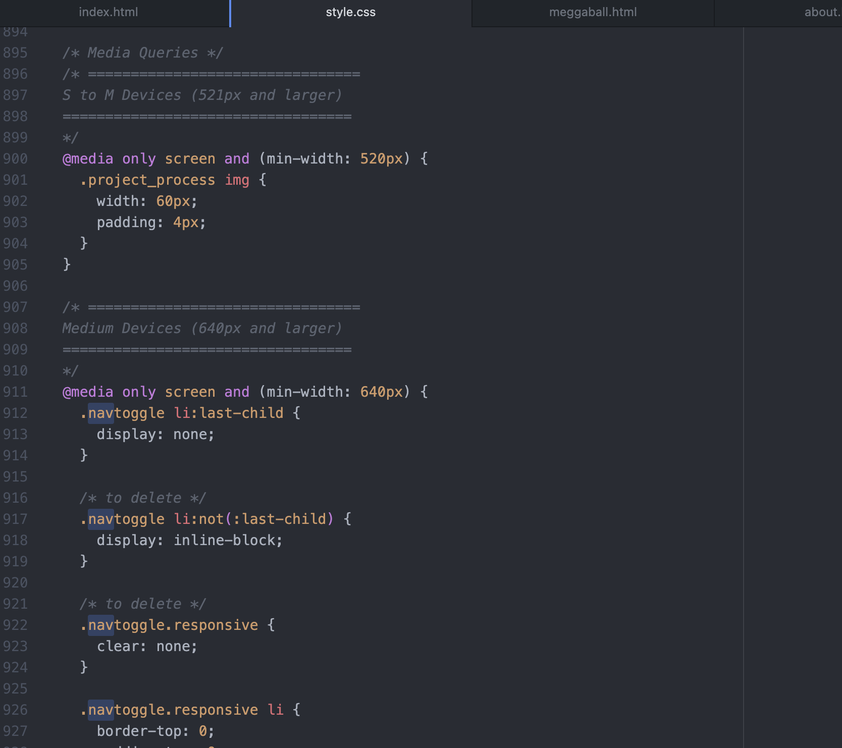
Media Query
The site was built on a mobile-first principle, and media query was used on CSS for a responsive design that worked on different screen sizes and viewpoints.
JavaScript
Additional jQuery was used during the iteration stage, but JavaScript was initially used for 2 reasons:
Mobile hamburger menu - the menu opens/closes when a user taps on the hamburger menu and displays all navigation menu options when opened.

“Back to top” button - The button appears once a user scrolls below 2,000px of a project page. This is to help users jump to other sections on the project pages by bringing users back to the top of the page where the section bar is.

4 User Testing & Iterations
5 users were each asked to run several tasks using a demo site that was set up for the test. Each user testing ended with open ended questions as well to get a better understand of the users’ frustrations, satisfactions, and general feedback. Based on the feedback and test results, the following iterations were made:


5 Website Launch
Once all iterations were made, the code was validated and a cross-browser testing was conducted to ensure the site works on all major broswers. Domain and web hosting services were purchased and all files were transferred using FTP.
Finally, all files were transferred and the website got published to https://CheekyChae.com. The following is a quick demo for how the site looks on both desktop and mobile.
Desktop Demo
Mobile Demo
6 Final Thoughts
-
Practice, practice, and practice
Turns out coding is not something you can learn overnight (surprise!), but it is definitely something you can improve the more you practice. What used to take hours for me now can be done in few minutes thanks to the numerous trial and error I have gone through building the site. -
Attention to details
Small details such as indentation or centering images comes a long way in making the site look clean and consistent. Going back and forth from my code editor to the browser and making sure these small details are aligned was critical during the site development process.
-
Importance of user testing
User testing proved extremely valuable for this project as multiple users pointed out similar problems. This was particularly true with the issues on information hierarchy where users found it difficult to locate content which led to iterations on headers and UI elements on the project pages.