UX/UI Case Study: Rebel Harvest

Native app designed to help reduce food waste by offering wonky fruits & vegetables
Overview
A 10-week team project focusing on user behaviour and UX design for reducing food waste through offering wonky vegetables and fruits that would have otherwise gone to waste.
Contributions
Strategy, Competitor Analysis, User Research, Testing, Information Architecture, Wireframing, Prototyping, Custom illustrations
Duration
Aug 17th, 2020 ~ Oct 28th, 2020
Challenges & Goals
- Given the wide spectrum of reasons why food waste occurs, identify a specific area that the team wants to focus on in regards to reducing food waste.
- Identify different players in the field and analyse the gaps in the current market landscape.
- Work as a team and design a native iOS app that can tackle the issue of reducing food waste.
Tools Used
Adobe XD, Miro, Google Forms, Excel, Adobe Illustrator, Adobe Photoshop, Procreate, Optimal Workshop
1 The Problem
Through research, we understood that roughly one-third of all food produced for human consumption gets lost or goes to waste. As a team, we have agreed to focus on consumer behaviour and the retail space within the food industry. In order to further narrow down to a specific problem, we each came up with 2~3 problem statements based on research, and each casted 3 votes to finalise and select a problem statement:
As a consumer, I’d like to get discounts on food that are close to their expiration date and/or may not look perfect. This will help not only save money, but also prevent unnecessary food waste.
2 Competitor Analysis
Based on the problem statement of focusing on “close to expired” or “wonky looking” food, the team decided to identify existing key players in the market for a competitive analysis. Six different competitors were analysed: Sirplus,
FoodCloud, Wonky Veg Box, Too Good To Go, Oddbox, and Karma.
With our analysis, we further narrowed down our focus area on the following assumptions:
- It is more impactful to tackle a production issue rather than food that has already been used for consumption (i.e. Too Good To Go, Karma). Solving food waste that can impact the production stage means farmers have a better way to predict demand. This translates to a far deeper impact to the entire food supply system compared to other stages.
- Only few of the competitors actually mention the environmental impact of reducing food waste, but even so, they fail to do it in a measurable or relatable way for the users to understand.
- The hypothesis is that consumers would want to know what is in the food box they have ordered, but most competitors do not disclose the specific items in a box (i.e. Sirplus, Oddbox).
- The assumption is that if the app facilitates the sense of “community” and “sharing ideas”, it will further motivate users to reduce food waste. Every competitor had some element of “community” in their branding, mainly using social media, but none of them actually had built this as an element of their products.
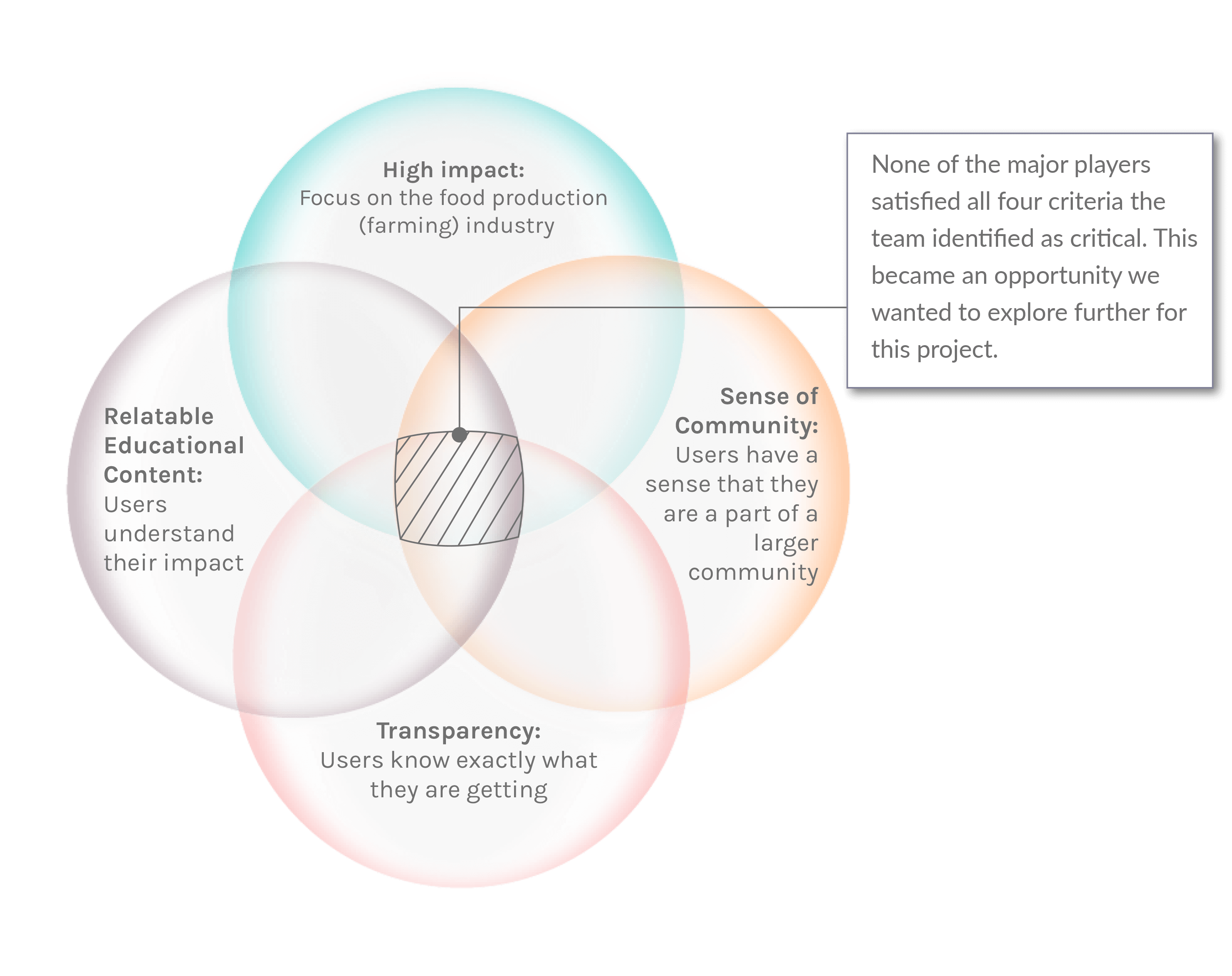
Through competitor analysis and market research, we have decided to narrow our focus on reducing food waste at the production (farming) level, delivering a transparent experience by educating users on their impact, providing customisation to select what users want, and finally motivating them through the sense of community.
3 Persona Development
User Interviews
We initially started off with a target audience of 25~50 year-olds, middle-class, urban dwellers. In order to validate the hyphotheses during our competitor analysis we conducted 6 user interviews and organised an affinity map.

We validated that while users have an interest in reducing food waste, they also want to understand the impact they have on the environment by doing so. Users also want to be able to select exactly what they are getting, but were uncomfortable with receiving close-to-expired food in their boxes.
Persona
Using qualitative data gained from user interviews, we adjusted our initial hypothesis and created a persona.

User Journey
User Journey was based on the scenario where our Persona, “Jenny”, would go through the ordering process for a vegetable box. Her goals and expectations are that:
- she would be able to purchase exactly what she wants;
- the order process is easy and simple.

4 User Flow
The team decided to focus specifically on the ordering process:
Overall navigation to the ordering process

Order process details


5 Information Architecture & Sitemap

While focusing the design on the ordering process, it was critical to build an overall information hierarchy to take a holistic approach and consider the different hypotheses that were validated during the user interview phase. Key areas and ancillary areas were identified:
Key Areas
- Transparency of food items
- Education on the environmental impact of users
- Focus on farming goods (vegetables & fruits)
Ancillary Areas
- Recipe building/uploading tool
- Building a sense of community
- Educational content (i.e. videos on how to use vegetables & fruits in cooking)
6 Wireframe and Prototype
Wireframe
The initial wireframe started off with five main navigation buttons - Home, Order, Recipes, Account, and Blog. The wireframes were limited specifically to the order pages.

Mid-Fidelity Prototype
As we started building our mid-fidelity prototype, we wanted to have an emphasis on the educational element of the app where users would be able to understand the environmental impact they were having by saving wonky vegetables or fruits. Thus, we expanded the order flow to start from a person on the homepage where we planned to have a personalised dashboard.

Another element that we have decided to design during the mid-fidelity development stage was the recipe section. Reflecting on the interviews, it was critical to educate users on how to use leftover ingredients which further strengthened the goal on reducing food waste.

7 UI Elements
Primary Colors
-
#F3F3F3
-
#FEC481
-
#A8CA91
-
#264653
Secondary Colors
-
#FFBD12
-
##F3722C
-
Gradient
Fonts
SF Pro Display was used for fonts mainly in two colors: #474A57 & #FFFFFF.
Illustrations
Original illustration work was developed for this project to create an inviting and engaging experience.


8 User Testing
Test Plan
To assess the mid-fidelity prototype, the team ran a usability test with 7 different participants. We developed a test plan and a test script in order to ensure consistency.

Feedback & Test Analysis
Feedback from the participants were categorised into Observations, Positive Quotes, Negative Quotes, and Errors/Critical Issues. For our iterative design process, due to time constraints, we decided to focus specifically on “Errors/Critical Issues”. However, we also created a backlog documentation in the case we were to revisit the project in the future.

Iterations
Focusing on the errors and critical issues we have identified as high priority during the user testing, we have iterated the following for the design:
- Create an Onboarding experience for users to educate what the app is about.
- Make the impact statistics more relevant to the users.
- Enlarge the order button to make it more visible.
Onboarding Screens
The goal of the app was not immediately clear to the users during the test so the team found it critical to create onboarding screens.

Relevant Impact Statistics
Users found it difficult to understand what the dashboard statistics actually meant so the team decided to make the numbers more relevant to illustrate the actual impact a user may have.

Larger Order Button
Users had a difficult time discovering the order button, so the team decided to enlarge the size considering its importance in purchasing decisions.

Preference Test & Further Iterations
There was a debate about the card designs for the different product offerings - mainly about the layout and the information hierarchy. Two preference tests were conducted to find out what potential users may prefer.

Results
Preference Test I
80% of the participants preferred the original design which was considered statistically significant. Some reasons worth noting are:
- Better use of space;
- Less scrolling;
- Cleaner look;
Preference Test II
60% of the participants preferred the new design which was NOT considered statistically significant. However, based on the additional information the participants provided, the team decided to adopt the new design with simplified text information. Many participants commented that the simplified version was much easier to read.
10 Final Thoughts
The team created a backlog list after user research and interviews and while we were able to make some iterations based on the results, the following are backlog items we did not have time for but it's worth mentioning for future considerations:
Errors
Had we had more time, it would have been great to understand and research where users can run into errors and how the app would provide feedback and guidance for users to rectify these errors. During the development process, the team acknowledged the importance of immediate feedback for these errors which would be great for future considerations.UI
More research on colors and fonts that has an emotional impact on users related to reducing food waste and the helping the environment is something the team would have liked to explore more.
Business Model
While we did a considerable amount of competitors' analysis and created our business model based on what we considered "missed" opportunities, we also acknowledge that we are not in the food industry or food supply chain field. In-depth interviews with experts in this field would help us understand what we would have to improve or what we are missing in our business model.